Alzheimer’s Society Unveils New Logo and Branding
Alzheimer’s Society, a leading UK dementia charity, has unveiled a new logo design and brand identity.
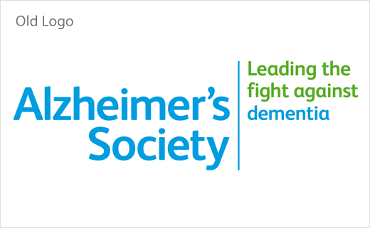
Its previous look was considered “passive, clinical and cold” – “it had little stand out and wasn’t engaging enough people,” say the charity’s bosses.
Working with London-based creative agency Heavenly, the charity therefore set out to create a new brand positioning that would be more engaging and accessible, especially to a younger audience.
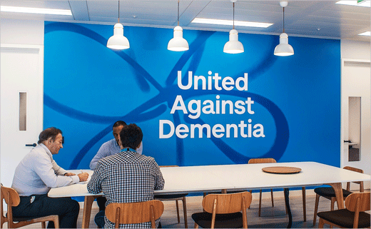
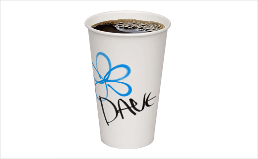
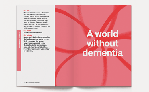
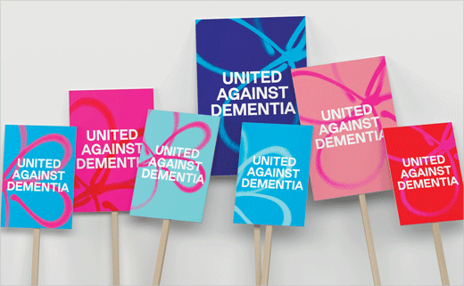
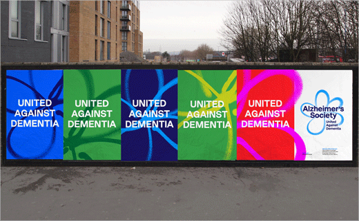
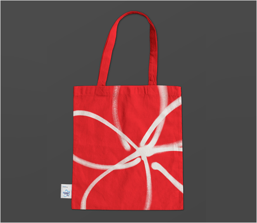
As a result, the refreshed logo – now featuring the Forget-Me-Not flower – gets a graffiti-style finish, while being accompanied by a new strapline – ‘United Against Dementia’.
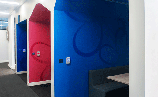
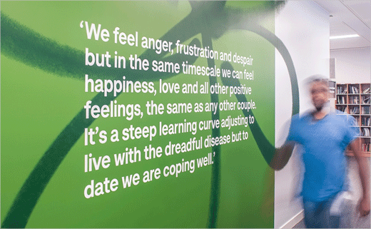
The visual identity has also moved from a traditional colour palette of blue and green, towards a brighter and broader “pop art-inspired” palette.
“Alzheimer’s Society needed to move from conventional to bold; from passive to disruptive; from isolated to inspiring. Dementia will affect us all, so the charity needed to be seen as being there for everyone,” says Fi Case, managing partner at Heavenly. “Consulting with people affected by dementia, we created a brand that resonates with them, reflects them and, crucially, will support the charity’s mission of reaching every single person affected by dementia.”



Heavenly
www.heavenly.co.uk


