B&B Studio Creates Logo and Packaging for ‘OATH’ Drinks
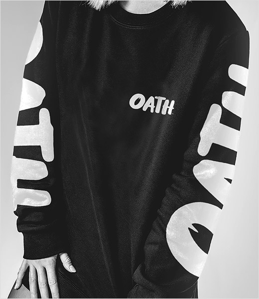
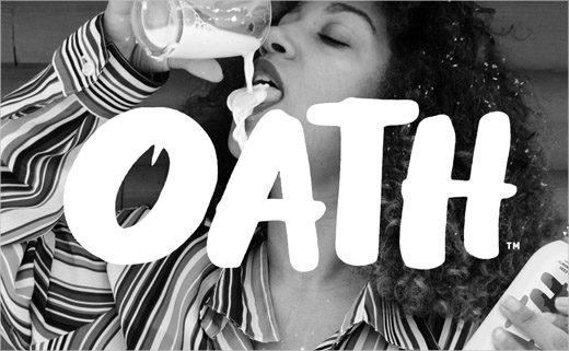
New organic-based drinks brand OATH has launched in the US complete with logo and packaging by B&B studio.
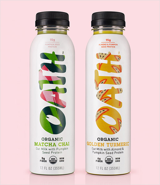
The London-based agency was responsible for creating the brand strategy, naming and visual identity, which has been expressed across the bottle design.
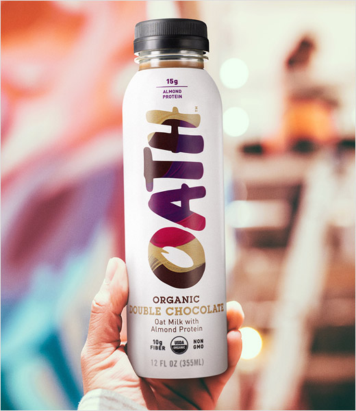
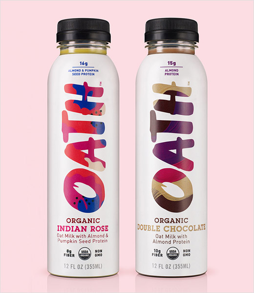
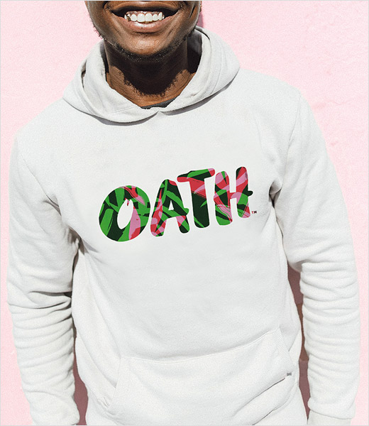
Details include a range of bespoke patterns that are deployed across all brand touch-points. Each flavour in the range, from Indian Rose to Golden Turmeric and Double Chocolate, is finished with a bespoke illustrative graphic, illustrated in-house, with colour combinations denoting the taste profile.
These illustrations are seen on each bottle, encased within the vertical OATH logo which features a graphic of a single oat within the ‘O’.
“The world of high-protein, functional drinks is dominated by monochrome and stripped back design codes, so we saw an opportunity to introduce a brand identity full of life and colour rather than these traditional codes of efficacy. We have graphically brought to life the vivid connection between body and mind, showing that OATH is about why we need to stay healthy, not just how,” explains Shaun Bowen, co-founder at B&B studio.
“OATH has been in production for almost two years, with tasting and testing to get it to the optimum grab-and-go format. The brand design perfectly brings to life the OATH promise, that we stop at nothing to provide a functional beverage that will benefit the body and help empower the mind,” adds the company’s founder and CEO, Royce Pinkwater.
B&B studio
www.bandb-studio.co.uk


