May 22, 2013
Categories:
Food
Drink Shop Identity Design: Cherries Tea House
Cherries Tea House is a tea shop in Tainan city in southern Taiwan. The drinking establishment has been in operation for over ten years, originally opening its doors back in 2001.
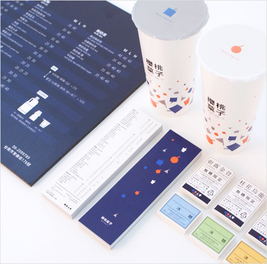
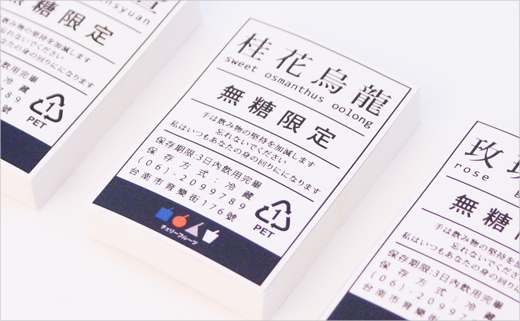
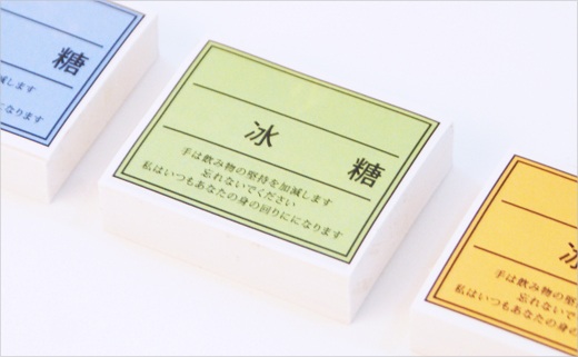
In June of last year, the business commissioned designer Chin Huan Chou, a graduate of National Cheng Kung University, to draft an entirely new corporate identity and packaging design system.
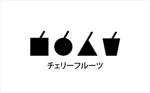
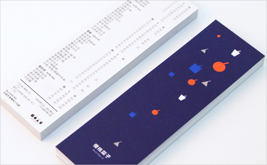
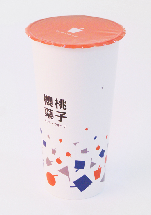
Evidently, the four diagonal lines atop the icons represent straws; in the case of the cherry icon, however, the line is principally designed to connote the fruit’s stem. The red-coloured cherry is propelled further towards the eye by being set on an indigo blue background.


Chin Huan Chou
www.behance.net/chouchinhuan


