Ebury Publishing Reveals New Logo Design
Ebury Publishing, said to be one of the UK’s leading publisher of non-fiction books and the non-fiction specialist of Penguin Random House has unveiled a new ‘un’-corporate logo.
The book publisher worked with London-based design and branding studio Form to create the new logo. Co-founded by Paula West and Paula Benson, the agency has recently rebranded Abbey Road Studios and the V Festival, and says its approach to the Ebury Publishing logo was “to reflect the creativity at the heart of the brand”.
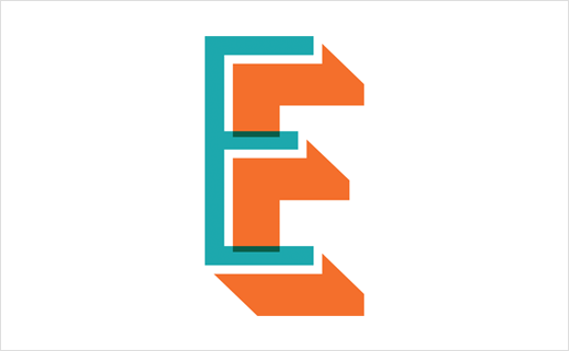
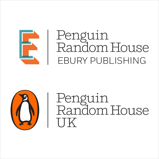
“The new logo is tall, confident and takes its cues from modern craft and maker cultures and lifestyles which in turn take their cues from traditional practises,” explains Jake Lingwood, deputy managing director at Ebury Publishing. “The new standalone capital E has been developed with an overprint effect, an ‘imperfection’ which is embraced in the spirit of creativity – the essential quality of a 21st Century publishing house.”
The new logo has also been created to work in unison with the Penguin Random House parent brand. The logos occupy similar physical space and now share the same Penguin orange colour. The ‘E’ logo orange is further complimented by teal blue.
“Ebury Publishing is a B2B brand and we wanted a logo that gave agents, authors and booksellers a feel for the qualities that make us a stand-out company; we are creative, commercial and great people to work with. We wanted something that reflected that but that doesn’t look ‘corporate’,” adds Lingwood.
Source: Ebury Publishing


