Milwaukee Brewers Reveal New Logo and Uniforms
American baseball team the Milwaukee Brewers have revealed a new logo and uniforms that will be worn beginning with the club’s upcoming 50th anniversary season in 2020.
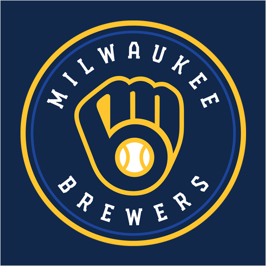
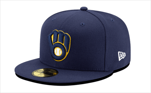
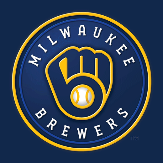
Designed in collaboration with Mississippi-headquartered agency RARE Design, the new logo is a modernised version of the team’s famous “ball-in-glove” logo that was first introduced in 1978.
Subtle changes have been made, with the “M” and “B” now linked above the glove’s webbing, symbolising “the unbreakable connection between the Brewers and the city”. The ball is now also more reminiscent of a traditional baseball, featuring two vertical seams dividing it into three segments – representing the city, the state and the largest segment, the fans.
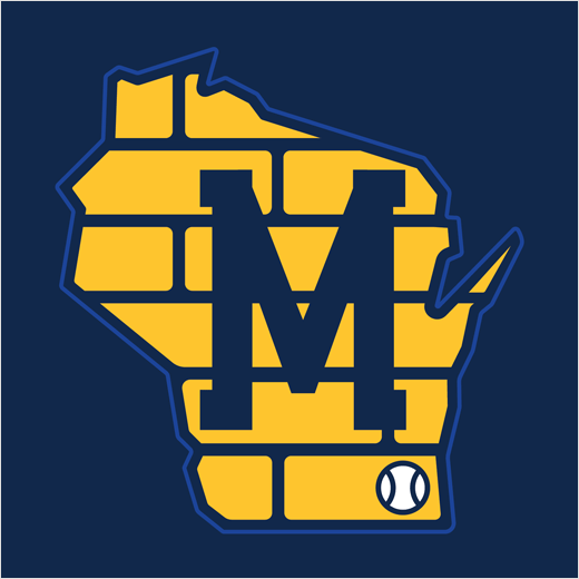
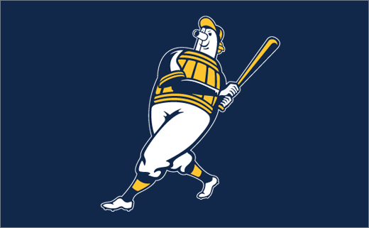
In addition to an updated Wisconsin state patch, alternate marks include a refreshed Barrelman mascot and a brand new wheat ball logo inspired by Milwaukee’s brewing tradition and the wheat featured in Brewers logos since 2000.
“This was a special process to be a part of for the Milwaukee Brewers and their fans,” says Rodney Richardson, founder of RARE Design. “Our goal was to develop a brand identity that depicted the story of the Brewers and their fans and characteristics of the city and state they call home. The result is a new look for the team which represents the history of this franchise and the vision for its future.”
The team’s new colour palette is anchored by navy, which the Brewers have worn since 1994. Accompanying navy are the colours yellow and royal blue.
“The yellow represents our city’s rich brewing legacy and joyful nature, while the royal blue represents the era that produced two postseason berths and a World Series appearance,” claims the club
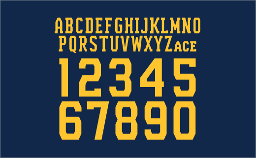
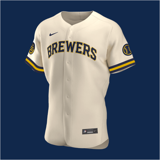
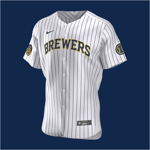
The Brewers’ new primary home uniforms are cream coloured – representing the “Cream City” – and feature elements from the team’s original jerseys, including a thick sleeve trim. Home uniforms will also include a modernised version of the Brewers’ original pinstriped set from 1978-89, updated with the team’s new colour scheme, typography and mark.
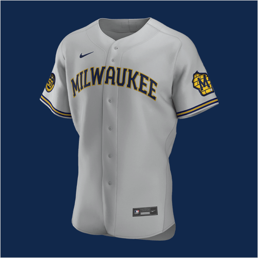
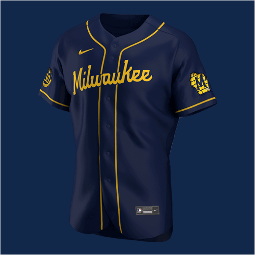
New grey away uniforms read “Milwaukee” across the chest and feature a Wisconsin state patch on the sleeve that has been refreshed to include Cream City brick, an industrial block “M” and a baseball representing Milwaukee’s location.
In addition to a new navy alternate jersey, which features its own bespoke “Brewers” script, the team’s alternate road uniform will also be highlighted by a two-tone hat as a nod to the hat worn from 1978-84.



Source: Milwaukee Brewers


