Navy Pier Debuts New Logo Design as Part of Major Rebrand
Navy Pier, said to be one of the top-attended destinations in America’s Midwest, has revealed its newly redesigned logo to the public.
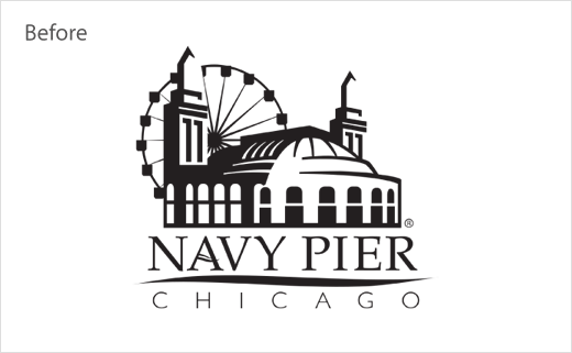
Created in partnership with Chicago-based brand strategy and design firm ColorJar, the redrawn logo accompanies the Pier’s brand refresh, which will be brought to life across the Pier, Chicago and the region beginning later this month.
The new logo design is said to be the result of a two-year process that involved public feedback collected by Navy Pier and its research and brand strategy partner Lipman Hearne.
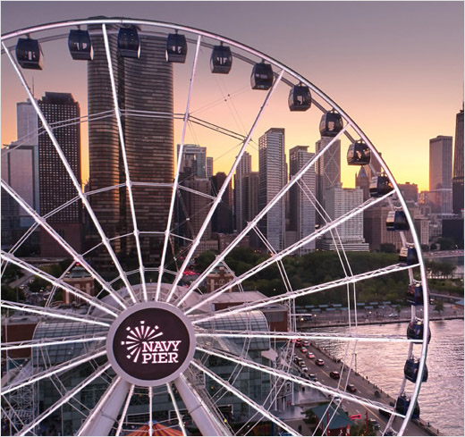
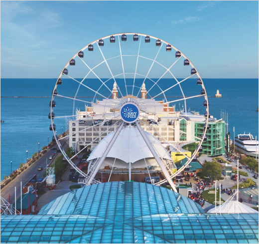
“The feedback indicated that based on Navy Pier’s bold and exciting new direction, the logo should also exude fun, energy, playfulness, celebration and colour in the form of a modern concept, while still incorporating iconic symbols, such as the Ferris wheel and fireworks, in a fresh, evocative way,” says a spokesperson for Navy Pier Inc., the not-for-profit organisation that runs and operates the famous tourist destination.
In late 2018, ColorJar was hired and then charged with producing a design with the aforementioned ideas in mind and creating a new logo that would mark the first step in the Pier’s brand overhaul.
“It was paramount to us, as the People’s Pier, that the new logo reflects Navy Pier’s mission of being a place that inspires discovery and wonder for its nearly 9 million annual guests,” explains Navy Pier president and CEO Marilynn Gardner. “The fresh, bold design illustrates the strong sense of pride, joy and community that Chicagoans and guests feel towards their Pier, now in its second century.”
“The new logo symbolises meaningful brand developments and pulls inspiration from the Pier’s history and landscapes. The featured colours are inspired by the physical environment of the Pier itself, including the deep blue of Lake Michigan at dusk, magenta of a bright fireworks show and lighter aquamarine blues from the lake in the heart of summer,” add the designers.
As part of the larger visual identity system, the team at ColorJar also utilised a 1927 photograph of a Navy Pier sign to recommend new typography that will be used both on the Pier and its accompanying digital brand communications.
“To design for Navy Pier is to design for Chicago itself, as the Pier is an iconic element of the city’s famous skyline. Creating a vibrant and welcoming new identity for an important part of the fabric of Chicago was particularly meaningful,” comments David Gardner, founder of ColorJar.


Source: Navy Pier


