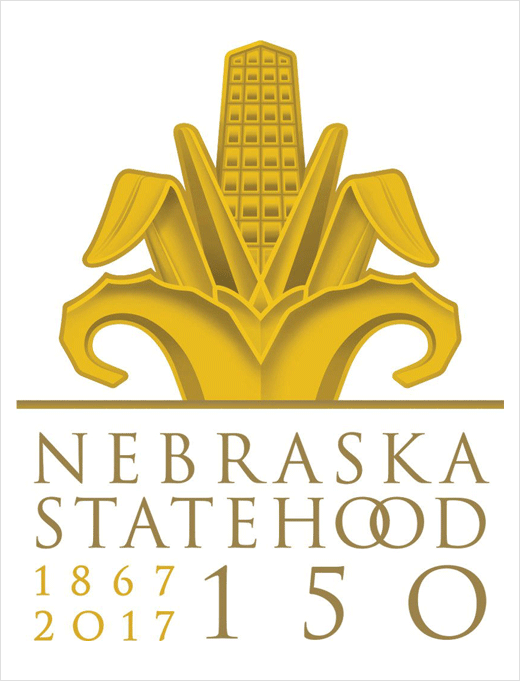
Nebraska Reveals Sesquicentennial Logo
The U.S. state of Nebraska has revealed a special logo design that has been created to mark the state’s 150th anniversary on March 1.
To help come up with the design, Ron Sack, head of design at Bailey Lauerman in Omaha, says he and his team spent hours researching Nebraska’s history. Trips to libraries, museums and the State Capitol building, as well as drives around the Nebraska countryside, are all said to have helped shape the logo’s design.
“I was born to do this,” says Sack. “I’m so passionate about Nebraska’s rich history, and I also love design.”
Sack worked with the governor, first lady and the Sesquicentennial Committee in finalising the design. The logo has already won an award from the Graphis Logo and Design Competition in New York. It will be published in its upcoming design annual, having been awarded a silver medal.
“Let’s celebrate who we are,” Sack adds. “Nebraska is the Cornhusker State. No other state can claim that.”
The logo is based on some of the iconography at the State Capitol building, which was designed by New York architect Bertram Grosvenor Goodhue in 1920. Images of corn can be found throughout the building. Sack therefore opted to use the art deco imagery to represent what is commonly known as the “Cornhusker State”.
However, Sack and his team did some modifications to the corn to also make it look like an office building.
“Some see corn, and some see a large office building,” explains Sack. “It’s also a nod to Nebraska’s business and industry.”

Bailey Lauerman
www.baileylauerman.com


