Pearlfisher Redesigns Tropical Soft Drink Brand – ‘Rio’
Pearlfisher has rebranded tropical soft drink Rio, giving it a new look aimed at a “younger, down-to-earth” demographic.
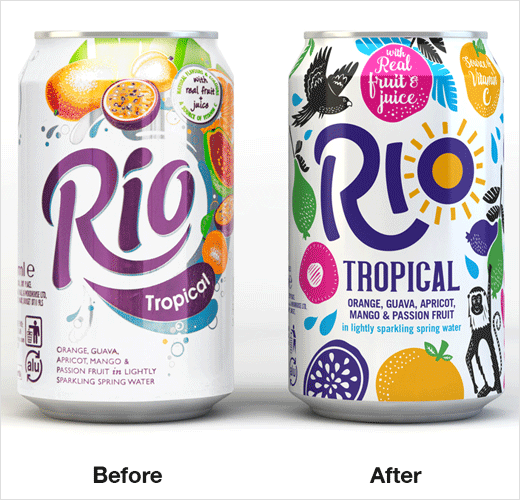
The previous identity was decades old, rooted in the mid-80s, which is when the product was first launched. Company bosses felt the design was in danger of becoming “dated and kitsch”, and therefore turned to Pearlfisher to give the drink a modern makeover.
“We identified an opportunity for Rio to own a ‘feel-good moment’ in a day and defined a set of brand principles inspired by a central strategic vision: ‘Celebrating the Sunny’,” explains Yael Alaton, strategy director at Pearlfisher.
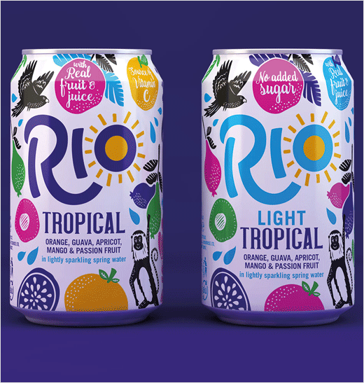
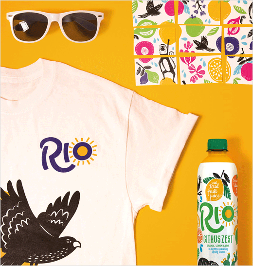
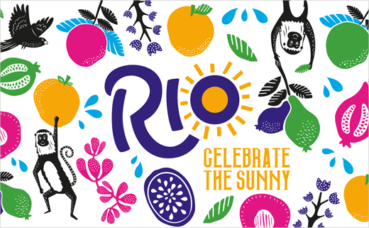
“Inspired by the inherent sense of happiness that Brazil, its people and its culture exude, Rio’s new identity is bright, vibrant and uplifting,” adds Poppy Stedman, design director at Pearlfisher. “To communicate Rio as a ray of ‘sunshine in a can’, we turned the ‘O’ in ‘Rio’ into a sun around which luscious fruits grow and developed a visual language that comes to life across murals, packaging, website and printed and campaign collateral.”
The newly designed two variants — Tropical and Tropical Light — will be available nationwide in cans, as well as bottles, a new format for the brand, at the end of May.
Pearlfisher has also defined a new tone of voice for Rio that is set to feature across all the brand’s communications channels, from social media and advertising to PR and customer service.
Pearlfisher
www.pearlfisher.com


