Pentagram Unveils New Identity for ‘Ten Trinity Square’
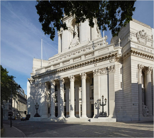
Pentagram’s John Rushworth has developed a brand strategy and visual identity for Ten Trinity Square, a redevelopment of the former Port of London Authority building in the City of London consisting of a private members club, 41 luxury residencies and a Four Seasons hotel. It is the first investment of Chinese conglomerate Reignwood, outside of Asia in super prime real estate.
Pentagram says the brief was to reinvigorate the purpose of the building and create a long-term vision that would also support Reignwood’s future investments in the sector. To do this, the project had to be positioned in a way that recognised its location, architecture and historical importance.
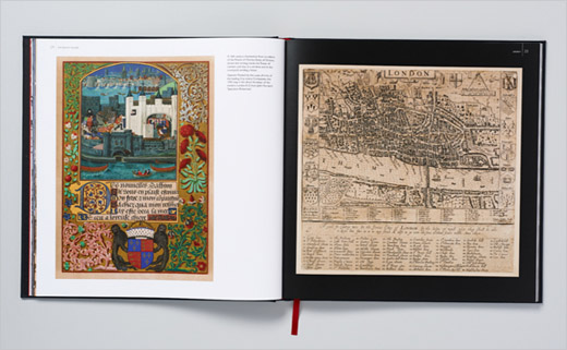
Its location has long been associated with London’s international status and trading relationships. Next to the Tower of London, it was first used by the Romans two thousand years ago as a place to trade pottery, wine and glass. The Romans gave way to the medieval merchants of London, who set up guilds that looked after the interests of tradesmen and their families. In the latter part of the 19th Century it became the base for the East India Company.
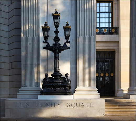
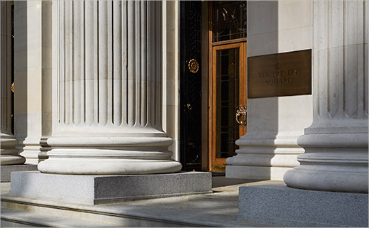
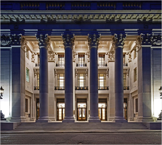
Ten Trinity Square took its modern form in the 1920’s, when it was constructed as the headquarters of the Port of London Authority. Built as a symbol of Britain’s global power, the neoclassical building was the physical expression of London position as the world’s most important port.
Rushworth and team say they had to develop a strategy that would be “harmonious with this history of global trade, whilst providing it with a new reputation relevant to super prime and prime real estate purchasers.”
The solution was found in the private members club, which could provide a venue for Sino-European commerce and cultural exchange for international business leaders.
The club also plays to Reignwood’s strengths because of their operation of business clubs in China, and their sponsorship of the Boao Forum, a non-profit organisation that hosts high level-forums for leaders from government, business and academia in Asia.
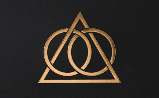
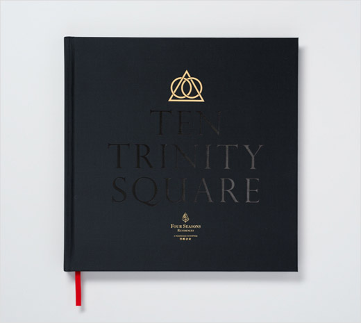
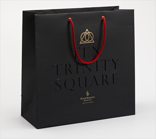
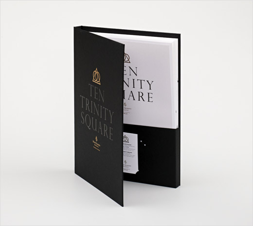
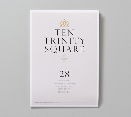
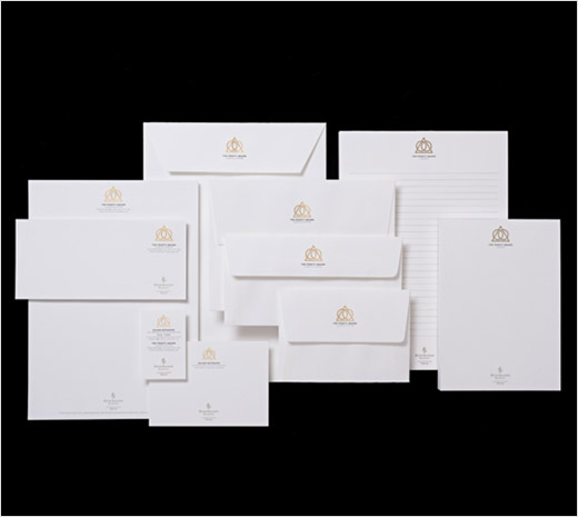
“The visual identity expresses the two oppositional attitudes that influence the reputation of the club and its members: power and understatement. The symbol infers the purpose of the club, with two circles (representing East and the West respectively) linked by a triangle,” explain the designers.
The classical lettering carved into the front of the original building provided a vernacular for delivering the logotype supported by a black, gold and red colour pallete that is relevant culturally in London and China.
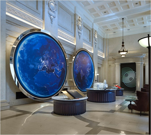
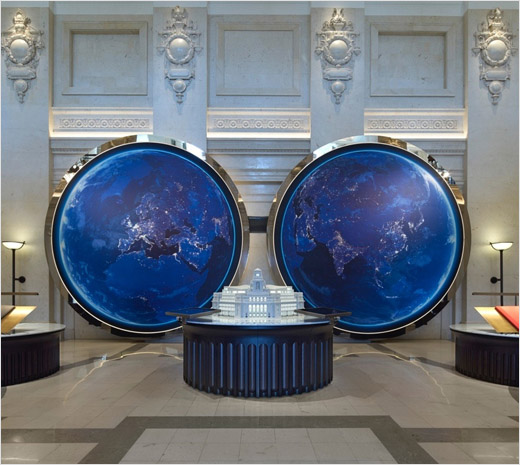
Following the development of the strategy and identity, Daniel Weil and Naresh Ramchandani created the interiors and films of the real estate marketing gallery.

Pentagram
www.pentagram.com


