University of Denver Unveils New Logo
The University of Denver today officially unveiled a new visual identity and brand-positioning statement.
The new brand is designed to honor the University’s long history of educating creative and independent thinkers, and brings to life the University’s vision statement—to be a great private institution dedicated to the public good. The brand positioning is designed to clearly define and differentiate the University’s identity to local, national and international audiences.
“We want more people to know more about us – about the quality of the academic enterprise at DU and its outcomes for students and about the role the institution plays in addressing the major issues of our time,” says University of Denver Chancellor Robert Coombe. “We want more people to recognize the qualities of the students that are graduating from DU and how their lives are impacting countless others. We are indeed a ‘great private University dedicated to the public good,’ and we want that broad array of constituents to understand precisely what that means.”
The brand positioning and visual identity were developed from extensive qualitative and quantitative research that involved thousands of respondents from across the country as well as within the University community: students, faculty, staff and alumni. The study explored—systematically and thoroughly—their perceptions of the institution.
The new brand-positioning, which focuses the University of Denver as a catalyst for public good, will provide the various schools and departments on campus with consistent language to be used in written and visual communications.
“We created the new brand positioning based on what people who know the University best said that makes us different from other institutions,” says Kevin Carroll, University of Denver vice chancellor and chief marketing officer.
“It’s a reflection of the actual experiences people have with us, so we are confident that the new positioning will be meaningful and relevant for a long time to come.”
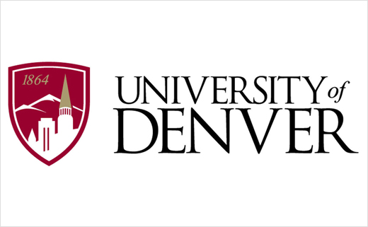
The new visual mark was developed out of the research, with the support and involvement from the schools, colleges and administrative units across the University. It replaces a mark used since the 1990s.
The new logo was designed to reflect the University’s stature within a dynamic city and region—characterized by opportunity and independent thinking. Its combination of traditional and modern elements demonstrates that the University is grounded in the past but oriented toward the future. The shield, which signifies tradition, incorporates three key elements: a vignette of the University’s skyline to emphasize the focus on academics and the scope of our aspirations; the date of the University’s founding, 1864, to communicate the institution’s longevity and strength; and a depiction of nearby Mount Evans to reference our inspiring location.
The colors crimson and gold have served the University throughout much of its history. The University of Denver logotype is rendered in Trajan, a modern font celebrated for its clarity, beauty and reverence for the classics.
“The new logo, with its distinctive shield, will more clearly identify and differentiate the University as a prestigious academic institution which provides inspiration from our geographic setting as well as strength and endurance from our history,” says Carroll.
The new logo was informally rolled-out on campus in July. It will be on prominent display when the University hosts the first Presidential Debate on Oct. 3.
Source: University of Denver


