Skincare Brand Vice Reversa Given New Look by Free The Birds
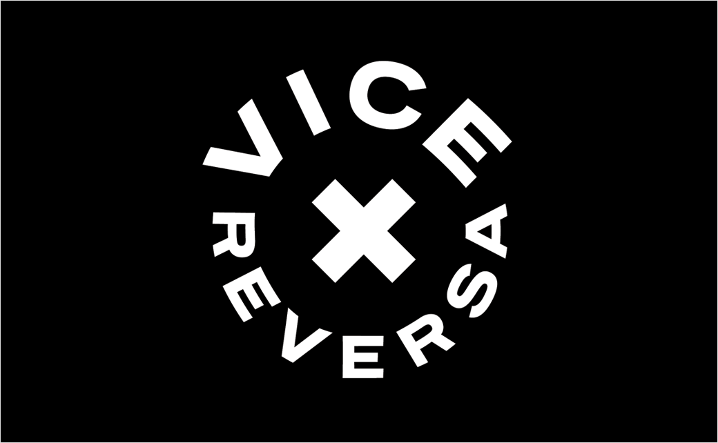
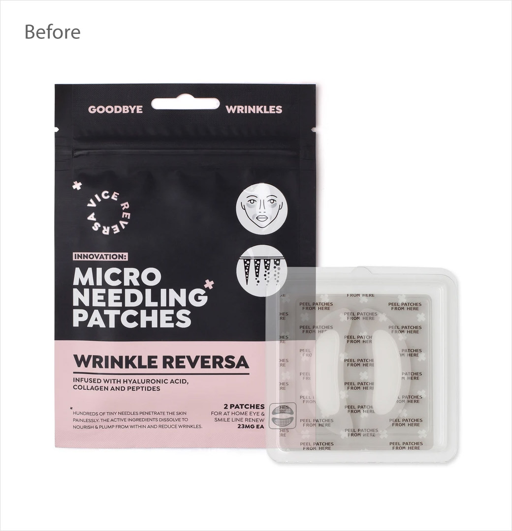
Creative agency Free The Birds has designed the new logo and identity for Vice Reversa, an Australian skincare brand that makes and sells micro-needle patches.
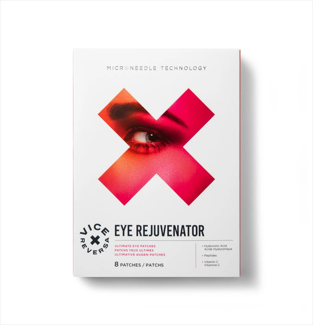
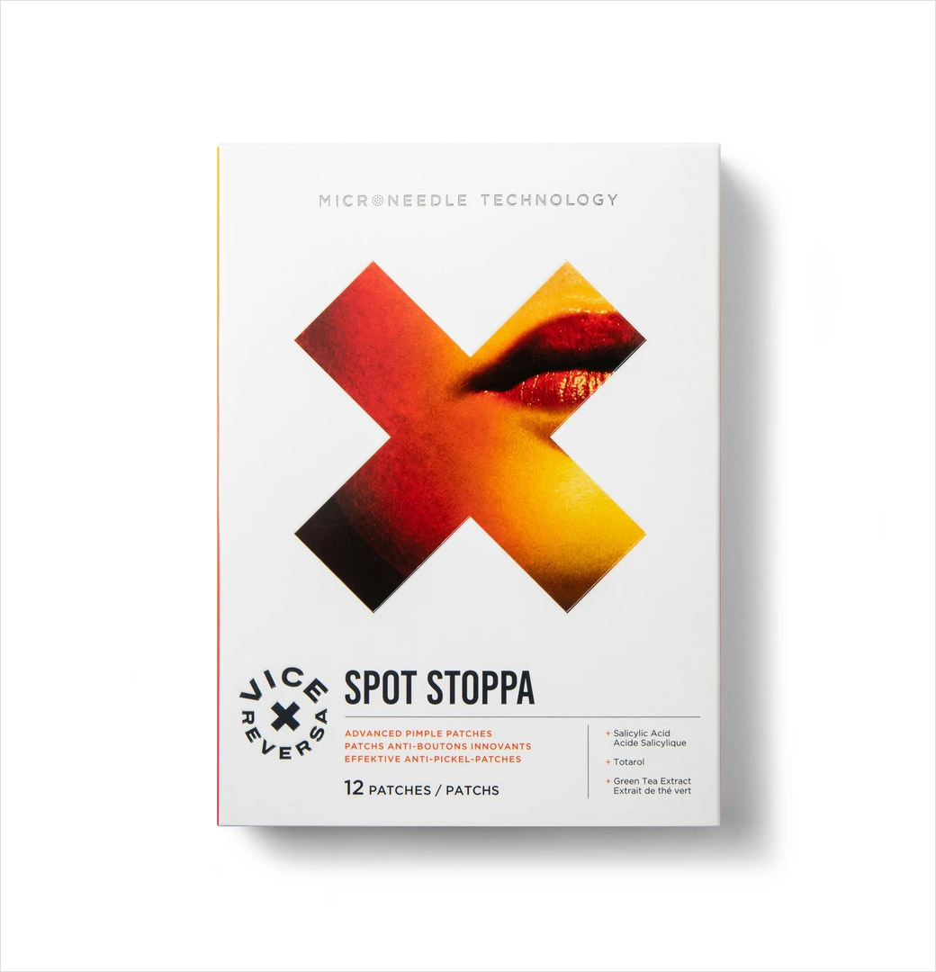
The company’s product range currently consists of two patches: “Spot Stoppa”, which, as the name suggests, specifically targets spots; and “Eye Rejuvenator”, which targets wrinkles and dull skin around the eyes.
Free The Birds says it was tasked with the challenge of more effectively communicating the “scientific intelligence” behind the brand’s micro-needle technology – both to help increase its visibility and to cement its credibility in the extremely competitive luxury wellness market.
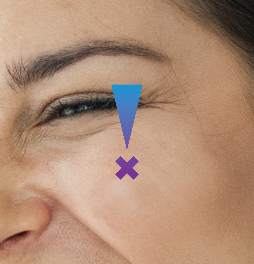
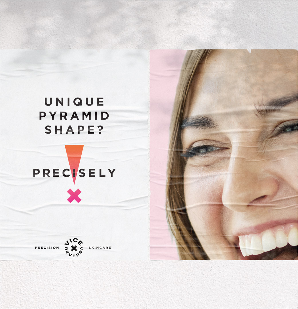
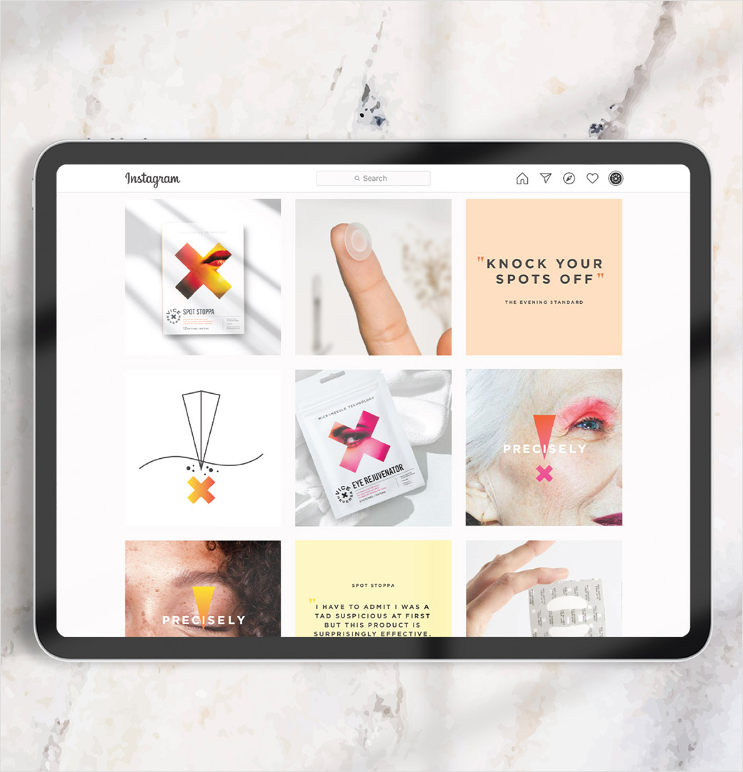
This is claimed to have been achieved through the use of new iconography, brand assets, and brand guidelines, with the centrepiece being a new exclamation icon-come-visual brand mark that serves as “a homage both to the company’s expertise in microneedle patches and the product’s direct application and quick results”.
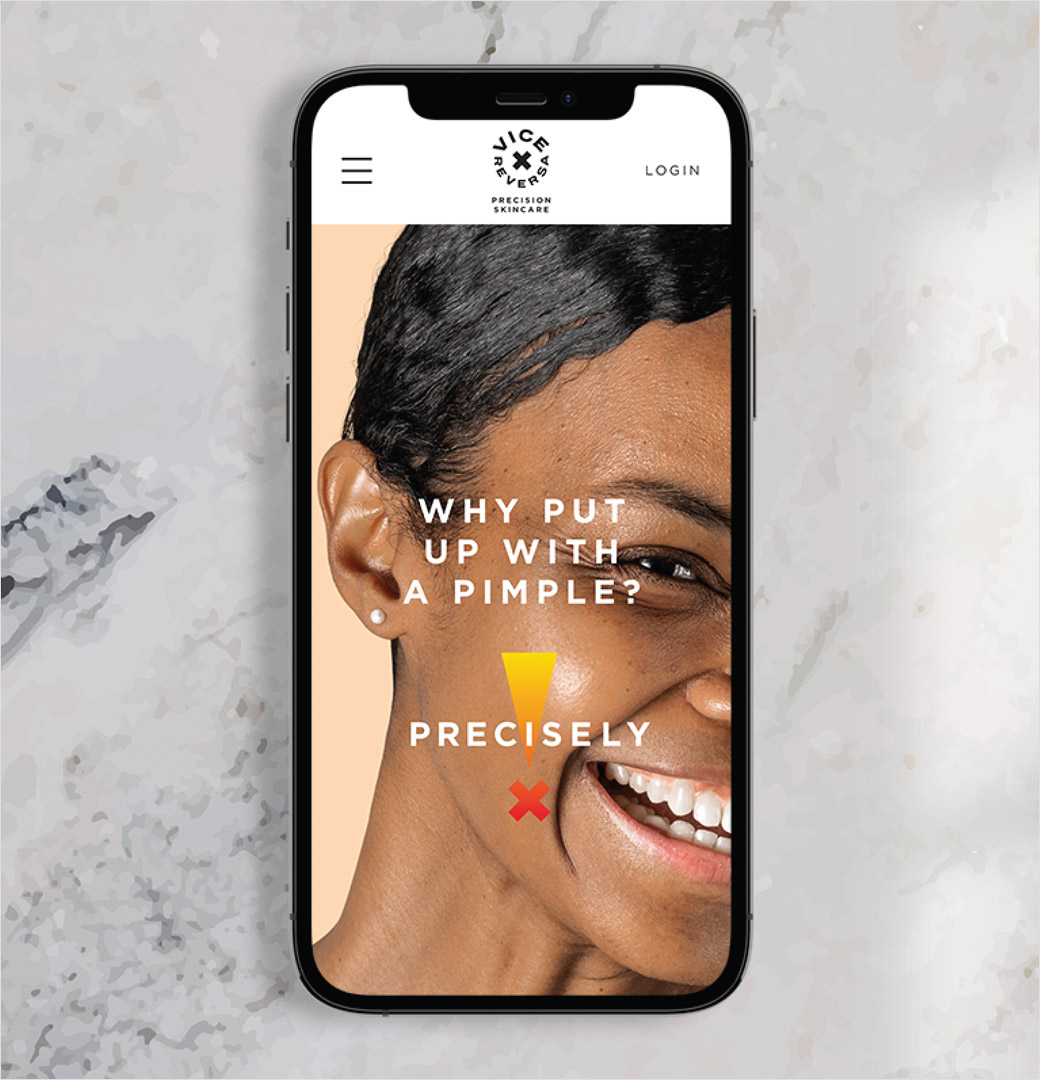
The refreshed identity also heroes the word “Precisely” while a corresponding tagline – “Precision Skincare” – combines with the redrawn logo on digital platforms to further reinforce the “medical-grade” quality of the products.
Free The Birds was also brought in as a consultant on Vice Reversa’s digital image and social media communications. The project included supporting the redesign of the brands website, creation of social media assets, and user-generated content advisory.
“Vice Reversa is a challenger skincare brand, so marrying the brand positioning with the packaging design was a challenging, but exciting task. To elevate the brand’s positioning, we leveraged its clinical messaging through memorable bold icons and tailored, but accessible language. We’re excited to watch the brand grow further,” explains Nick Vaus, partner and creative director at Free The Birds.


Free The Birds
www.freethebirds.com


