Sunshine Rebrands Roald Dahl for New Global Audience
The Roald Dahl Literary Estate has appointed creative agency Sunshine to develop and evolve its proposition and branding. This is the first time a unifying identity has been developed to live across the estate’s multiple properties and activities.
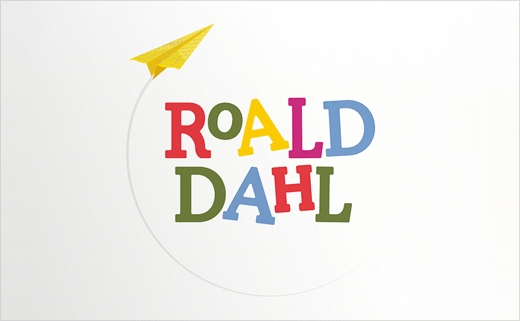
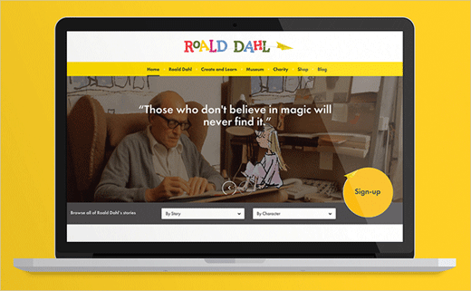
The agency has subsequently defined the three guiding principles for the estate to uphold as: ‘masters of invention’, ‘makers of mischief’ and ‘champions of good’. These have been visualised through an entire rebrand with a new logo and animation.
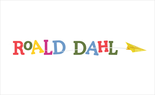
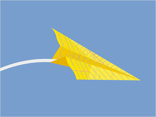
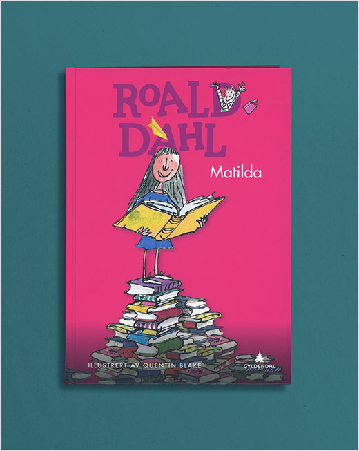
Inspired directly by Roald Dahl, the new visual identity and animation features a paper plane, made out of the distinctive yellow legal paper on which he wrote. The icon references his experience as a pilot and life-long love of flight.
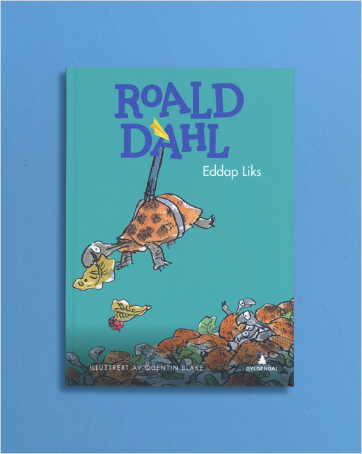
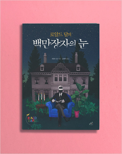
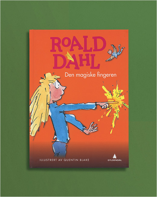
The logo’s colourful typeface is also said to draw inspiration from some of the author’s most popular creations. The Roald Dahl colour palette includes a range of colours such as “Willy Wonka Purple” and “Enormous Crocodile Green”. It will be seen across all Dahl associated media, publications and products, including apps and digital channels.
Sunshine collaborated with creatives, director Chris Dooley of Not to Scale production studio, along with music composer Nick Ryan. They worked to create a logo animation that aims to bring the Roald Dahl name and paper plane to life.
Sunshine
www.thesunshinecompany.com


