The Surgery Rebrands Hawk-Eye Innovations
West Sussex based design and digital agency The Surgery has completed a rebrand of sports technology company Hawk-Eye Innovations. The Sony Group company is probably best known for it’s ball tracking technology that is used to officiate major sporting events like Wimbledon and the English Premier League, but is growing to the point where it now work’s with over 17 different sports around the world. The agency says it was given a brief to create an “exciting, robust brand”.
Working with Kim Parker, Hawk-Eye’s marketing director, the Surgery design team say they had to consider all the usual application restrictions – not least digital, to create a future proof identity suitable for their mostly B2B audience.
“Hawk-Eye has become an expected part of many sports fixtures around the world. However the company is evolving and now has a range of innovative solutions for sports feds, broadcasters and sponsors that go beyond officiating and broadcast enhancement, which we’re probably best know for. We asked the Surgery to create a brand that properly reflected Hawk-Eye’s position in the world of sport and are very pleased with the results.”
Hawk-Eye had undertaken a brand audit and developed a set of messages which would inform the new brand, including mission, values and tone of voice. The Surgery was brought in during the final stages of this audit to help explore how the results could be reflected in an appropriate visual language and, over several months, worked with the Hawk-Eye team to generate a variety of concepts, eventually settling on the identity shown here.
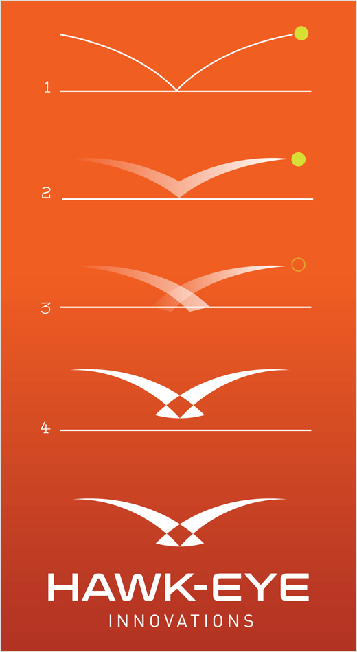
The final mark, claimed based on the arcs formed by a bouncing ball, creates the shape of a “soaring hawk” with its obvious connotations.
“Although B2B focused, consumer recognition is important to Hawk-Eye. Their name is already recognised by sports fans worldwide, but the visual identity is less so. The new ID is intended to look comfortable in an environment rich with sports brands logos and appear familiar from the get-go,” explain the designers.
The dynamic shape and supporting typeface are combined with an orange colour palette.


The Surgery
www.ineedsurgery.com


