Thonik Creates New Identity for the Holland Festival
Dutch design agency Thonik has created a new identity for the Holland Festival, which is said to be is the oldest and largest performing arts festival in the Netherlands. The event takes place every June in Amsterdam.
The new identity also marks the beginning of Ruth Mackenzie’s tenure as creative director. She was the former director of the London 2012 Cultural Olympiad.
The Holland Festival has a tradition of adopting graphic styles that borrow from the history of Dutch graphic design.
In 1995 Anthon Beeke adopted a conceptual style for the event that removed letters from the title, which was the first step towards using a logo.
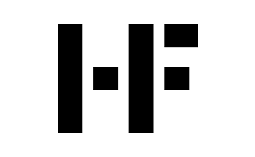
In 2005 Maureen Mooren and Daniel van der Velden – the last graphic designers to work on the Holland Festival – pared back Beeke’s design even further to create the simpler HF logo.
“A logo is the simplest way of becoming recognised in the deluge of commercial signs and symbols we face every day,” says Thonik’s co-director Thomas Widdershoven. “It is about becoming as visible as possible in the public domain where commercialism is the spoken language. And to work, the logo has to connect a visual quality with context and content.”
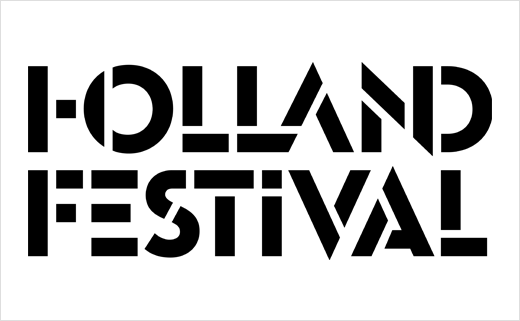
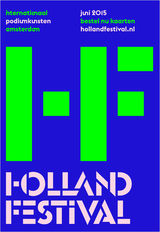
Thonik took the existing HF logo and fused the letters H and F into a single ligature. However, they say the first results of the ligature were illegible and unclear.
“More elements needed to be deleted for the full strength and clarity of the concept to shine. So, after joining everything together we needed to find a way to rip it back apart,” explains Widdershoven.
Eventually the designers say they found their solution in Milton Glaser’s 1970 stencil.
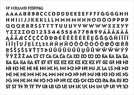
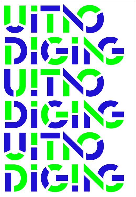
Based on this ligature-stencil combination, Thonik then created a new typeface in collaboration with font foundry Bold Monday.
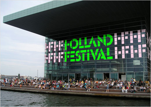
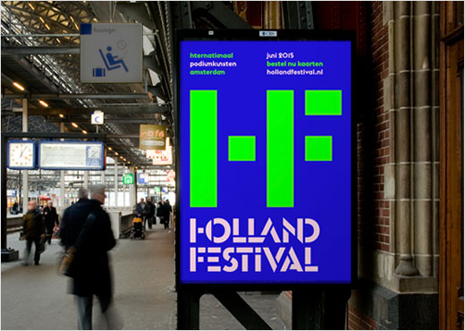
For this first Thonik edition of the Holland Festival dubbed the “Festival Edition” the colour palette is a strong green and blue with a paler contrasting pink.
“Green stands for a renewed spring and a clean idea. And blue is the night sky – an evening out at the theatre,” says Widdershoven’s fellow co-director Nikki Gonnissen.
Thonik
www.thonik.nl


