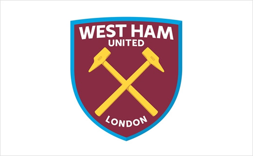
West Ham to Get New Logo Ahead of Stadium Move
West Ham United supporters have endorsed the idea of evolving the club’s crest.
Seventy-seven per cent of the thousands of fans that participated in an independent SMG YouGov survey said they backed updating the crest to reflect the club’s history and heritage in a new era.
The new design will come into effect following the club’s move to the Olympic stadium in 2016/17.
A strong 65 per cent of respondents opted for a modernised, bolder and cleaner typeface to be displayed. Just five per cent wanted no typography whatsoever and a further five per cent supported the inclusion of the acronym WHUFC. Only three per cent of supporters, meanwhile, called for the addition of 1895.
Elsewhere, only 56 respondents thought any change of crest colours was necessary. Of comments made on the matter, there was universal agreement that claret and blue should remain.
Additionally, the topic of London drew some debate. General feeling suggested that the inclusion of the word ‘London’ would celebrate the Club’s position in the capital, while also acknowledging the Hammers’ provenance.
However, some fans have criticised the removal of the castle symbol associated with West Ham’s home stadium Boleyn Ground.
Following the launch of the online crest poll, there has also been much talk of the crest’s 3D presentation that was shown in a specially made reveal video.
West Ham officials say the 3D form of the crest will primarily be used across digital platforms, while a number of flat, single-colour variations will be more commonly seen on merchandise and the like, including the playing shirt.
That said, the Club says it is still absorbing feedback and, should there be overall support for the direction of the crest, these factors will be considered and potentially incorporated ahead of producing final brand guidelines.


