Carvel Ice Cream Cakes Roll Out Updated Logo and Packaging Design

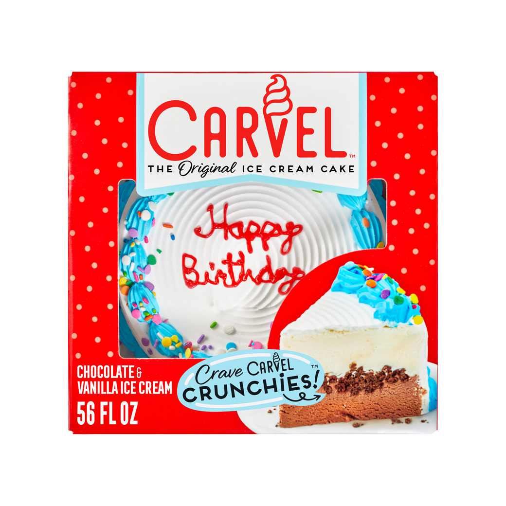
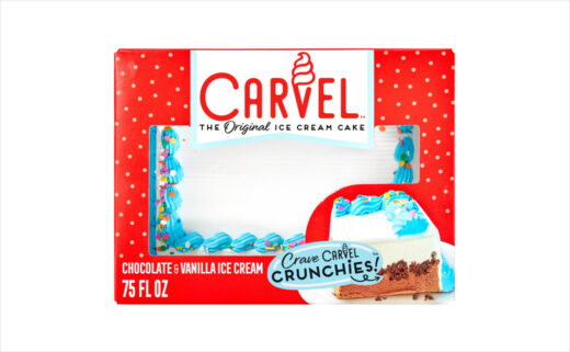
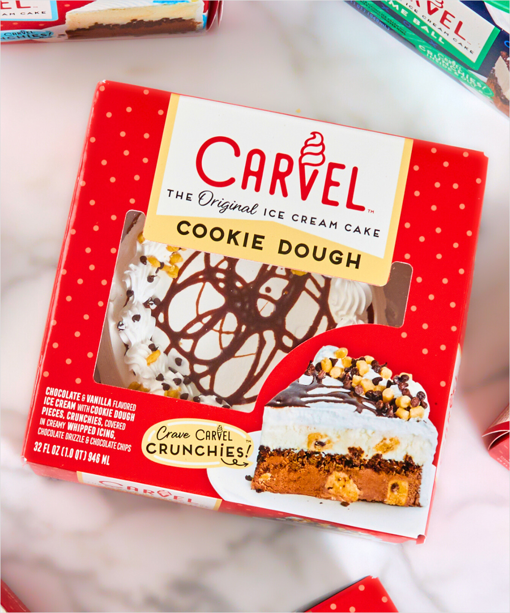
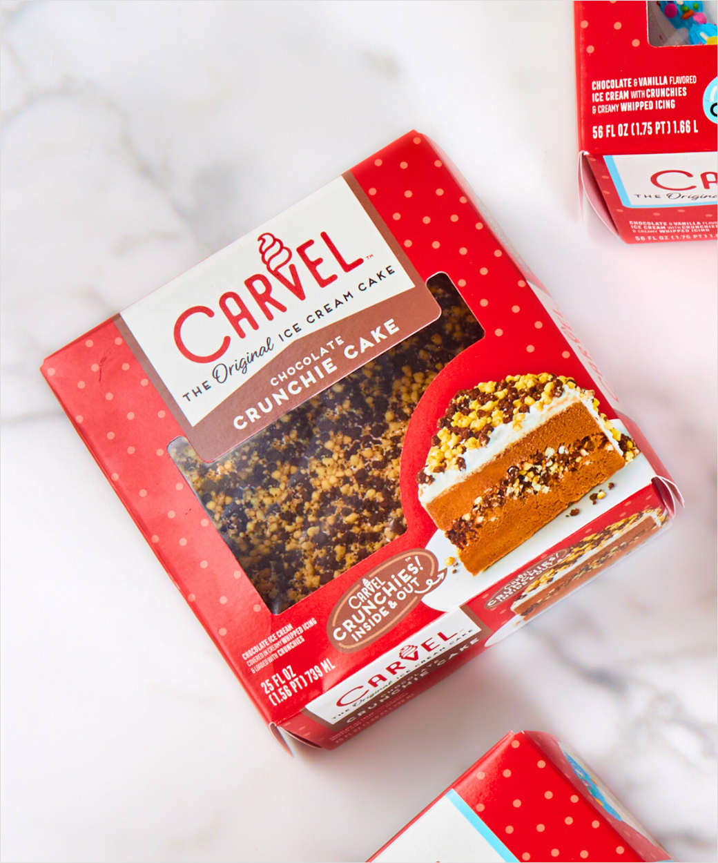
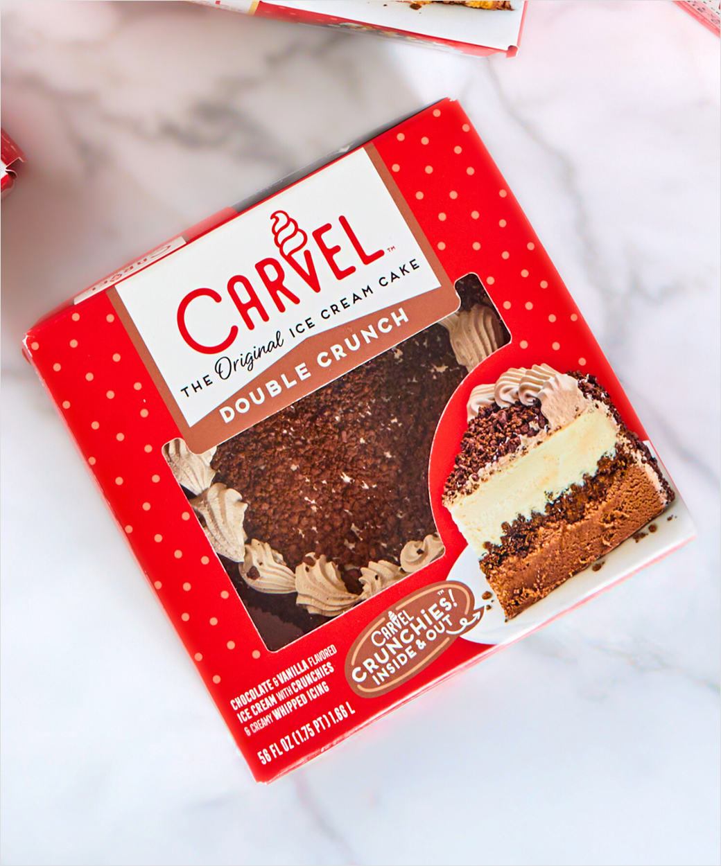
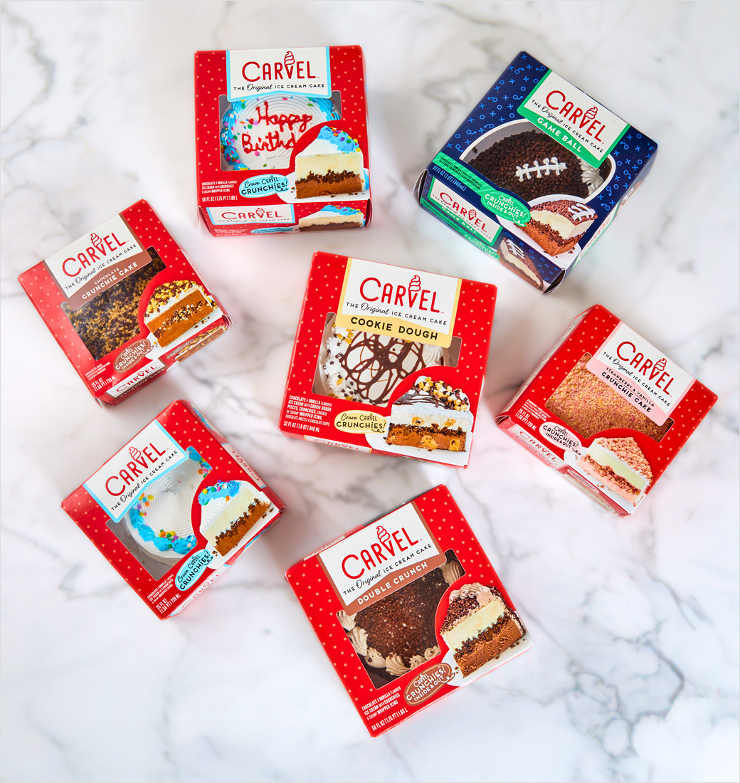
Carvel, the American ice cream brand, has revealed a fresh packaging design for its cakes.
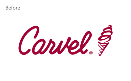
The new look design is said to come after a recent logo refresh.
The latter reflects the brand's history, with the 'V' in Carvel resembling a cone filled with soft-serve ice cream, the popular treat that founder Tom Carvel began selling nearly 100 years ago; the brand is credited with being the first to create and market soft ice cream in the U.S. during the 1930s.
This piece of history has also inspired the new tagline, "The Original Ice Cream Cake", which appears on the new packaging.
"The fresh look brings Carvel's recent rebrand to life, pairing the brand's classic heritage with a brighter, bolder, more modern personality," says parent brand I Love Ice Cream Cakes (ILICC).
Adding: "Pops of summery yellow join Carvel's signature cherry red and blue frost, plus playful design elements and iconography nod to Carvel's rich history and nearly a century of ice cream cake innovation."
"We believe that what we've come up with conveys the spirit of Carvel Founder Tom Carvel – Mr. Carvel himself – who always had fun in mind when it came to work. We're proud to bring that playful energy to a new generation of ice cream cake lovers," further comments Kim Mrowczynski, brand marketing manager for ice cream cakes at Rich Products, the food conglomerate that owns Carvel.
Source: Carvel


