NASA Reveals 60th Anniversary Logo

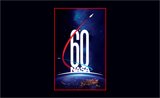
NASA has released a commemorative logo to mark its 60th anniversary. Created in-house by graphic artist Matthew Skeins, NASA says the logo depicts how the organisation is "building on its historic past to soar toward a challenging and inspiring future".
President Dwight D. Eisenhower signed NASA’s founding legislation, the 1958 National Aeronautics and Space Act, on July 29, 1958. NASA considers its formal birthday to be October 1, the day the agency first opened for business.
The newly-revealed celebratory logo features the famous "NASA" acronym as well as the number "60" – the two of them then stacked atop the continental United States, the curvature of Earth, and the light of an approaching dawn.
"The United States is shown at night beneath a sparkling web of yellow lights. This symbolises NASA’s vibrancy and relevance, the inspiration derived from NASA’s work, and the solid foundation of the 'best and brightest' among industry and academia upon the agency’s leadership in space is built," said a spokesperson for the aviation and space agency. "The light blue and white arc just below the alphanumeric elements recalls the sunrise, seen 16 times each day aboard an Earth-orbiting spacecraft, and symbolises opportunity yet to come through exploration of the Moon, Mars and destinations far beyond."
Additional design details include two vectors, one blue and one red, circling the alphanumeric elements and pointing toward the dark outer edges of the logo "as if zooming into the unknown". In doing so, they form a "6", which is emblematic of the number of decades since NASA was established. Depicted at the tips of the vectors are also the key elements of NASA’s deep space transportation system, the Space Launch System rocket and Orion crew vehicle.

Source: NASA


