Flexdrive Car Subscription Service Reveals New Logo Design
Vehicle subscription service flexdrive has revealed an all-new logo and website design as part of a major rebranding effort.
Describing itself as a “Netflix for cars”, the rideshare service launched in 2014 and is currently available in 17 cities across the USA. It has also recently expanded into Europe in countries such as Denmark and Norway.
“The previous brand identity was suited for an early-market and early-stage company, but, given the pace of change in the subscription market as a whole and flexdrive’s deep history and market position, it is the right time to update with a fresh brand identity to better convey the business’ story and overall offering,” says the Atlanta-headquartered company.
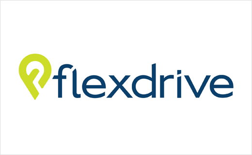
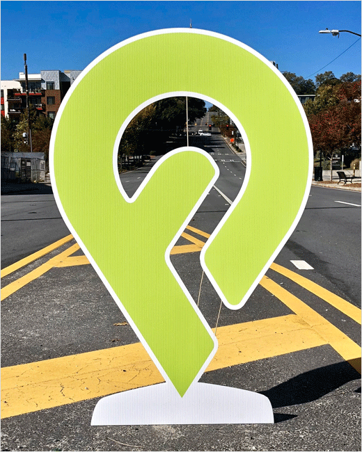
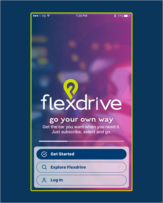
The new logo combines the “f” and “d” from flexdrive into an icon that is designed to be reminiscent of a location mark.
Set in blue and lime green, with support colours for the brand of purple, pink and grey “that connote energy and forward movement”, the logo is further accompanied by the company’s new tagline “go your own way”, which it is claimed emphasises “a feeling of no boundaries and enforces the sense of freedom, control and peace of mind offered by a flexdrive subscription.”
“A refreshed flexdrive brand signifies the journey we are all on in the evolving vehicle subscription space,” explains Chowning Aguilera, who is responsible for the company’s brand growth and marketing. “Our previous logo and message platform showed where the market was at the time, but both our company and the market have taken leaps and bounds in the past four years. We believe that it is important to communicate who flexdrive is and our new branding more properly reflects our culture and philosophy.”
Source: flexdrive


