Slack Unveils New Logo and Identity by Pentagram
Popular workplace chat app Slack has unveiled a new logo design as part of a major rebranding campaign.
The new look, which represents the first update to Slack’s brand identity since it launched in 2013, comes ahead of plans for the company to go public later on this year.
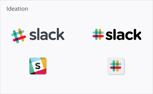
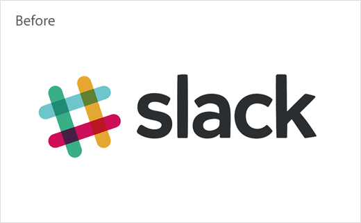
“Our first logo was created before the company launched. It was distinctive, and playful, and the octothorpe (or pound sign, or hash, or whatever name by which you know it) resembled the same character that you see in front of channels in our product,” wrote the Slack team in an official announcement published on the San Francisco-headquartered outfit’s website.
“It was also extremely easy to get wrong. It was 11 different colours—and if placed on any colour other than white, or at the wrong angle (instead of the precisely prescribed 18º rotation), or with the colours tweaked wrong, it looked terrible. It pained us.”
Slack’s in-house design team therefore partnered with branding agency Pentagram to create the refreshed logo and accompanying visuals.
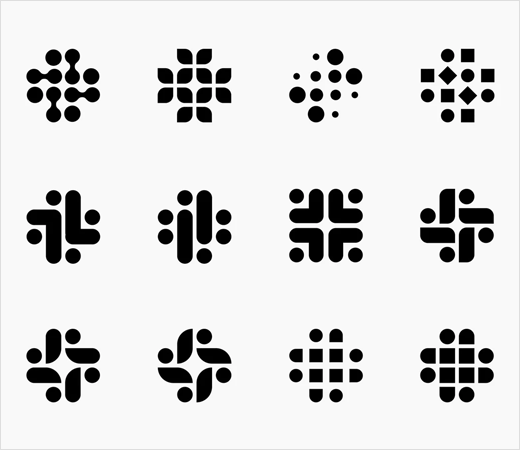
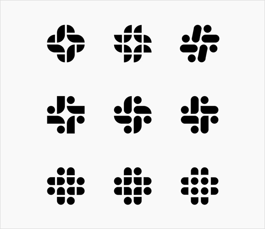
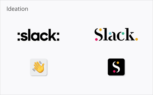
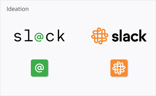
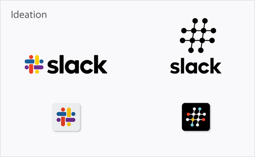
When developing the new look, Michael Bierut and his team of designers say they considered a number of possibilities, “from options that suggested connect-the-dots, complex knots, emojis and people-like shapes, to systems that celebrated the platform’s unique visual vocabulary”.
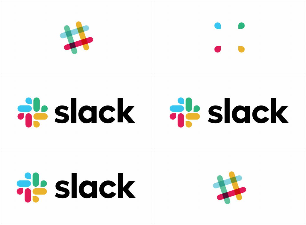
In the end the team decided to keep “the equity of Slack’s familiar octothorpe, retooling it to eliminate reproduction challenges and increase consistency across applications.”
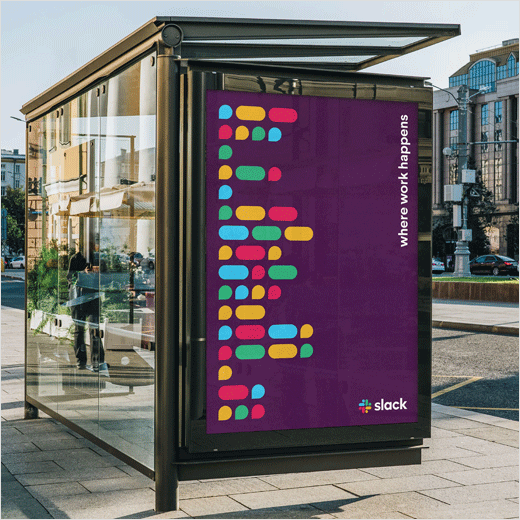
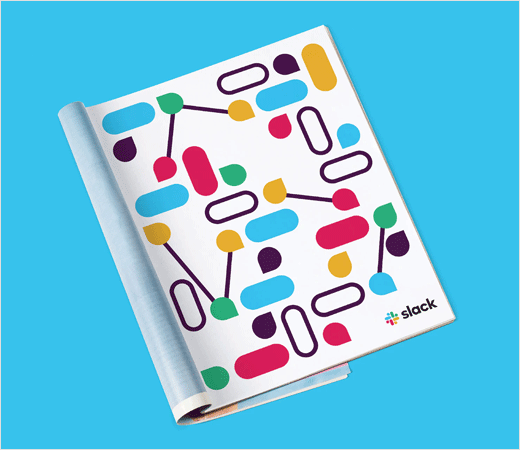
As such, the new octothorpe is comprised of two basic geometric shapes, namely, a speech bubble and lozenge, while the updated palette also features four primary colours, which is deemed more manageable than the original’s eleven.

Pentagram
www.pentagram.com


