Crypto Exchange Phemex Introduces New Logo Design

Crypto exchange Phemex has introduced a new logo and improved platform design.
The refreshed look is said to signal the start of a larger rebranding effort.
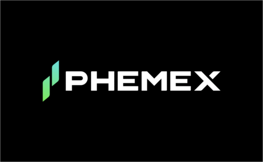
Phemex's updated logo features a "two-candle" design – described as a minimalist representation of "growth, movement, and upward momentum", according to the company.
The two lines are also said to symbolise "balance, continuity, and duality between performance and reliability".
The new colour gradient shifts from deep green, which reportedly stands for stability and trust, to bright blue, which signifies "innovation and forward energy".
"This one-of-a-kind spectrum reinforces the brand's association with prosperity and progress," claims Phemex.
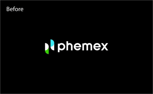
The typography has also changed, with letterforms now said to be based on a "geometric foundation", shifting from softer curves to stronger, squared edges.
"This precision-engineered wordmark conveys a heightened sense of reliability and architectural integrity," the company asserts.
Additionally, Phemex's new platform interface includes updated 3D visuals, a unified icon system, and layouts that are said to enhance usability and focus, giving traders "a cleaner, more intuitive environment" across both desktop and mobile.
"Our new logo and platform design embody what Phemex stands for today – precision, performance, and progress," comments Federico Variola, CEO of Phemex.
Adding: "This redesign is not merely aesthetic; it reflects the mindset that has always defined Phemex – building for the future while staying true to our core of efficiency and reliability."

Source: Phemex


