Quantilope Reveals New Corporate Logo
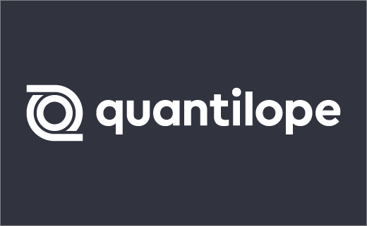
Market-research analytics firm, quantilope, has announced a comprehensive design relaunch that includes a new logo and brand appearance.
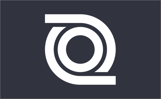
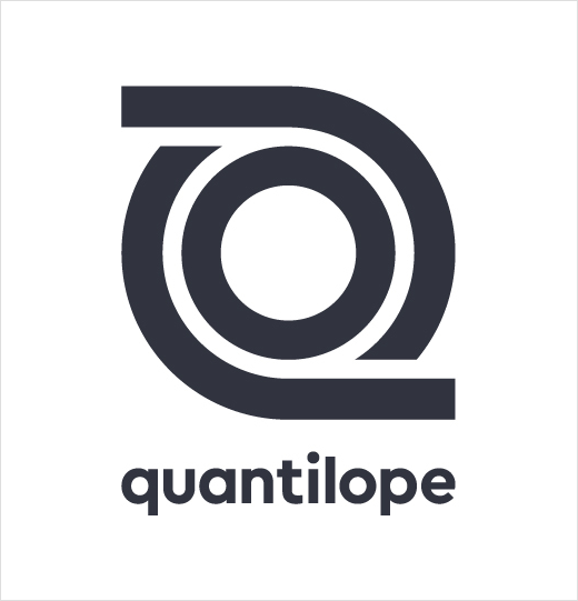
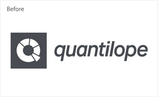
Doing away with the old ‘donut’ design, the company’s new mark is said to be based on a loop, and is further claimed to reinforce “the nature of a technology platform for intuitive, iterative work”, as the Hamburg-based tech startup’s chief offering is a software programme that is claimed to deliver real-time insight into consumer behaviour; it is reportedly used by the likes of corporate giants such as Unilever and L’Oreal.
The refreshed identity also features new typography, which uses the pan-European Cera font family.
“The straight, sans-serif font shape emphasises clarity and efficiency, well-suited for international use in multiple languages,” says the company.
In terms of colours, while the primary corporate colours remain dark grey/anthracite and white, the spot colour palette has been expanded to include warm yellow, bright red, clear blue, mint, and turquoise.
Additional details include new imagery that focuses on people, largely depicting the company’s own personnel.
“quantilope’s design relaunch is the logical result of our international corporate strategy, connecting our global offices, and sharpening our profile as a leader in the future of market research,” explains Dr. Peter Aschmoneit, CEO and co-founder of quantilope. “Our new logo offers a modern feel with geometric shapes and fresh colors to underscore our strengths – quick learnings, quality, empowerment, and agility in insights management.”
Source: quantilope


