The Little Potato Company Unveils New Logo and Packaging Design
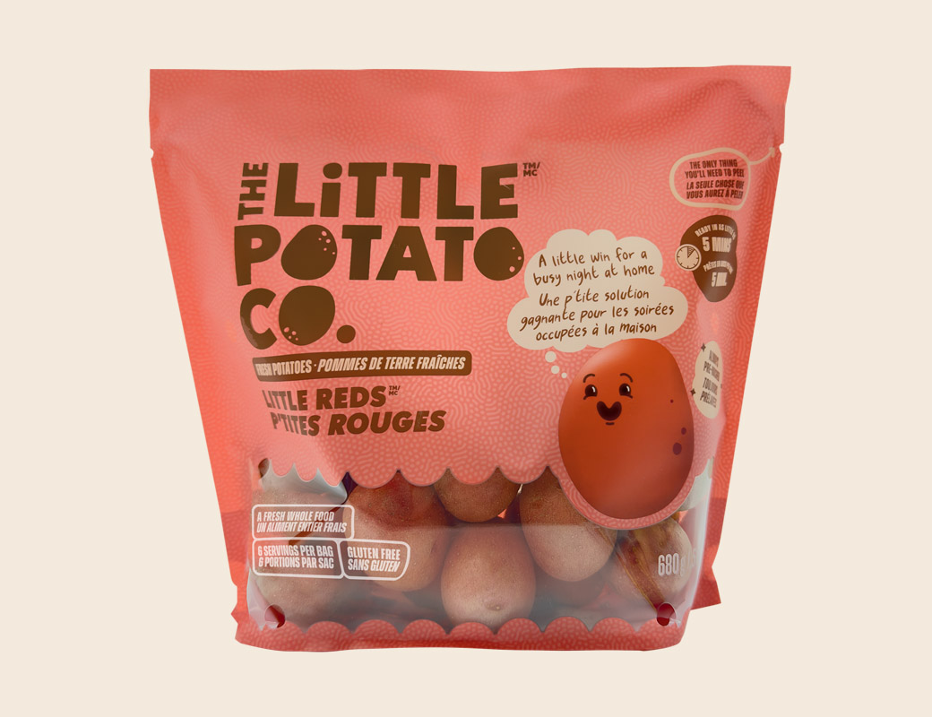
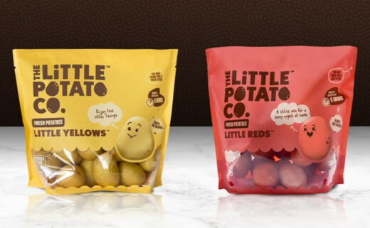
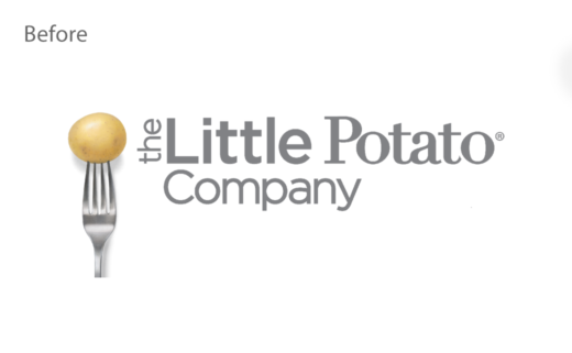
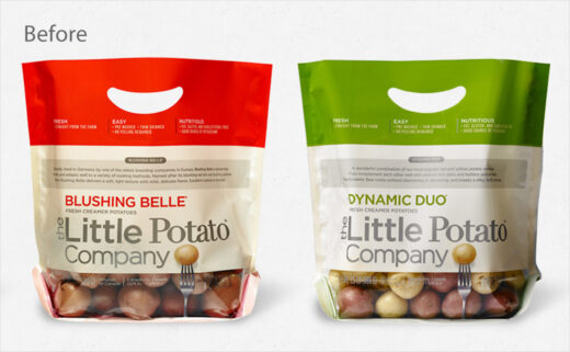
The Little Potato Company has undergone a brand refresh that includes an all-new logo and pack design.
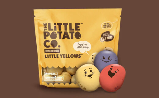
The latter now incorporates cooking instructions, a recipe, and a QR code, while new brand characters – dubbed "Spuddies" – feature across a completely new website as well as in a new digital ad campaign.
There are also new names for the potatoes, namely, "Little Yellows", "Little Reds", and "Little Trios".
The Edmonton-headquartered firm's pre-washed mini-potatoes are reportedly sold in 20,000 retail locations across the U.S. and Canada.
Accompanying the updated visuals are the results of a new survey conducted by the company that suggest nearly one third (31%) of parents feel they do not eat enough home-cooked dinners with their family.
"We're passionate about making it easier for families to enjoy a little moment of happiness by making dinner easier through our convenient and delicious Little Potato products. With no prep and minimal cooking time, there is less time in the kitchen and more time together," says Angela Santiago, CEO and co-founder of The Little Potato Company.

Source: The Little Potato Company


