Supermarket Giant Aldi Reveals New Logo Design
Discount supermarket chain Aldi has unveiled a new logo design as part of a rebranding programme that is aiming to “modernise” the German company.
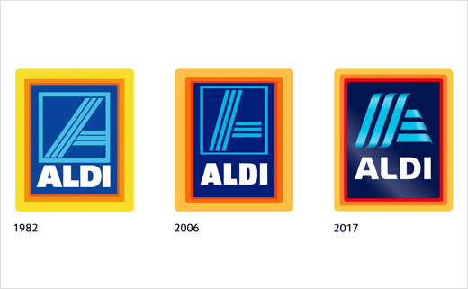
The retailer’s blue, red and orange badge now takes on a more three-dimensional look, with a gradient effect giving the light blue “A” a ribbon-like appearance. Other changes include a modified logotype as well as brighter colours.
Designed by Germany-based consultancy Illion Markensocietaet, the new look is being described as an evolution rather than a revolution.
“It is receiving a more dashing design, which reflects dynamic improvement and innovative changes and developments that have recently characterised the firm,” Aldi says about the new logo design.
The outgoing logo was designed in 1982, and introduced the cut-off “A” on a blue background in a three-colour frame. Slight modifications were made to the logo colours in 2001 and again in 2006.
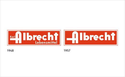
Aldi was originally founded by brothers Karl and Theo Albrecht in 1946 when they took over their mother’s store in Essen which had been in operation since 1913.
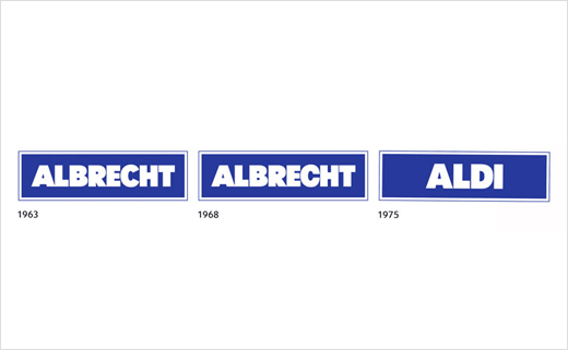
The brothers then built up a chain of stores that were named Albrecht until 1962, whereupon the name Aldi was first introduced, and which combined the words “Albrecht” and “Diskon” (“Discount”).
In the UK, Aldi this year overtook Co-op to become the fifth-largest supermarket in Britain.
Source: Aldi


