U.S. Supermarket Giant Kroger Reveals New Logo Design
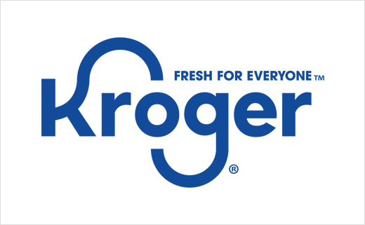
American supermarket chain Kroger has revealed its new logo as part of a major brand transformation campaign.
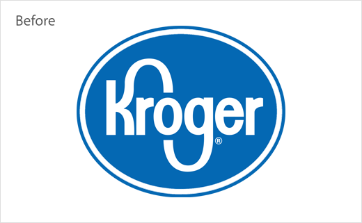
Doing away with the old elliptical-shaped enclosure, the refreshed logo is claimed to reflect the company's "strong, food-rich heritage by retaining the shape and movement of the iconic 'K' and 'G'".
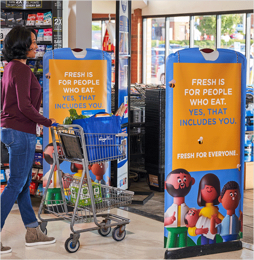
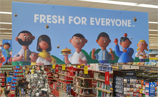
The new design also incorporates the tagline "Fresh for Everyone", which Kroger says is "simple and designed to drive an instant understanding of the uniquely egalitarian American brand."
"Kroger's new brand celebrates our love of people and our love of food, cutting through the 'sea of sameness' that has beset grocery retail advertising for far too long. Having a more consistent and recognisable brand enables Kroger to stand out and engage our customers in an even more compelling way," reckons Kroger's vice president of marketing, Mandy Rassi.
"Advertising in the grocery space was universally a sea of sameness: generic aisles of groceries and close-ups of people cutting carrots. Yet, Kroger is anything but generic. So, we wanted to take their inclusive and uplifting promise to their customers and find an effective and creative way to share it with the world," adds Lisa Topol, co-chief creative officer of DDB New York, the agency responsible for creating the new look.
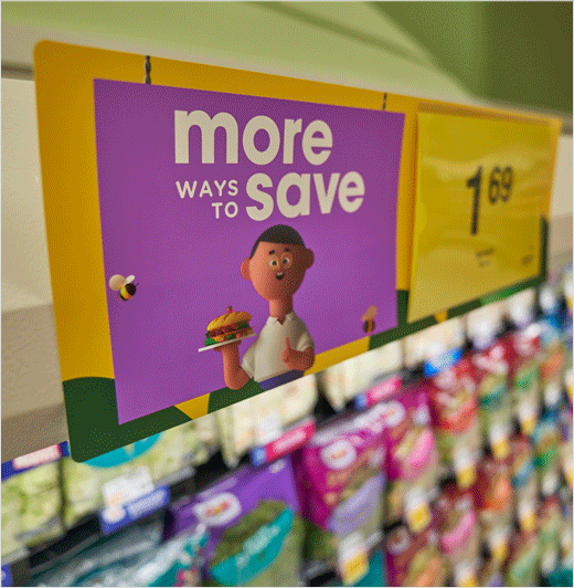
The updated identity also includes "Krojis", which are effectively emoji characters that represent "customers, associates and communities in an inclusive, relatable, optimistic and fun way."
Source: Kroger


