United Soccer League Reveals New Logo Design
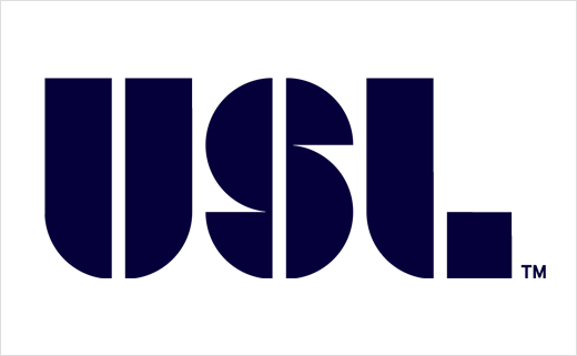
North America's United Soccer League has announced it is changing its name. As of now, USL PRO will compete simply as the USL.
USL presently functions as the third soccer division in the US, coming behind Major League Soccer and the North American Soccer League in the hierarchy.
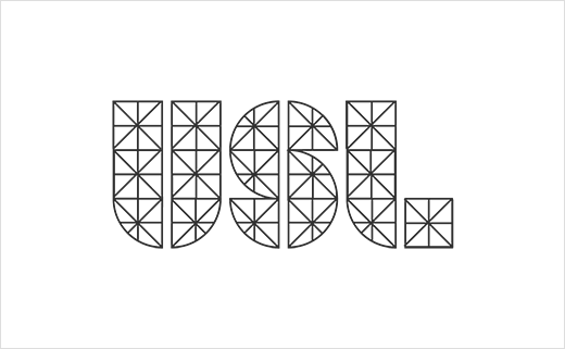
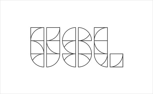
The new USL mark is the key component of the design. Said to have been inspired by the geometry of the field, the USL says it "design cues are more akin to a 21st century startup than those of a monolithic sports league."
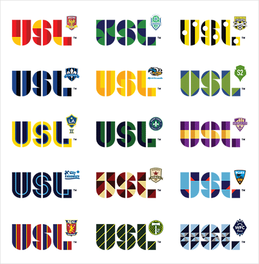
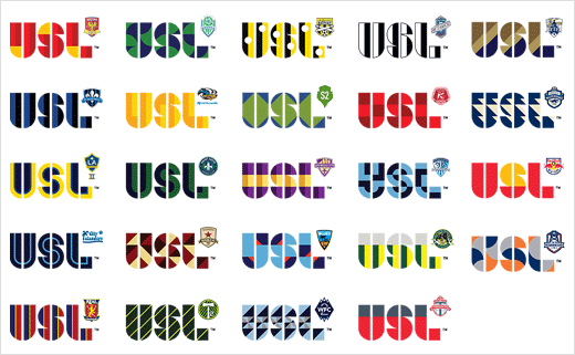
The league's bosses are keen to point out the the new logo "is not a corporate logo"; instead, it is being envisaged as "a tribal mark", something that can be "explored and developed" by clubs and fans. The shapes of the USL lettering therefore appear as a stencil and hint at its flexible use.
Football is said to be the fastest-growing sport in America. This season, the USL will feature 24 competing clubs, a number that has doubled since 2011.
The new identity design has been developed by Good Omen Partners, Red Antler and Steve Haslip.
Source: USL


