
Clean Home Brand Dropps Unveils New Logo and Packaging Design

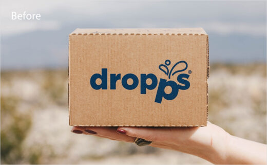
American home care brand Dropps has revealed its new logo and brand identity.
The update brings what is claimed to be a warmer and bolder look than before.
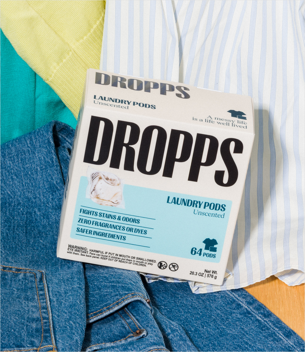
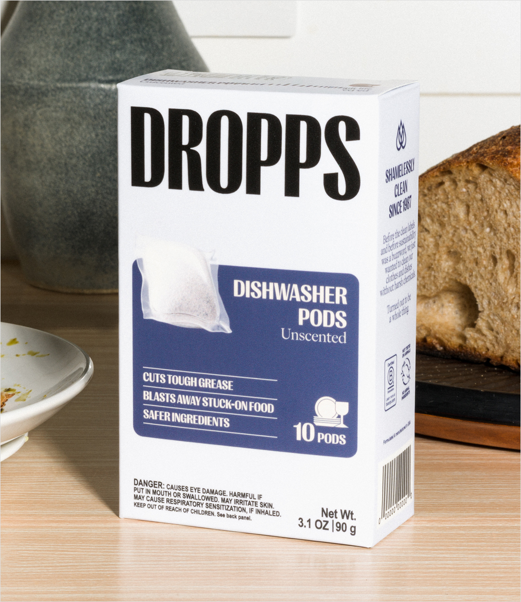
It includes fresh packaging, a redesigned website, a new Instagram account, and a 'streamlined' product range focused on Dropps' main items: laundry pods and dishwasher pods.
Using the new brand message, "Messy Life. Kind Ingredients. Actually Clean.", the fresh identity is said to represent the company's shift toward being a "clean and healthy" home brand, with "a deeper focus on the science behind Dropps’ biobased formulas and new third-party certifications".
"The new creative world is designed to feel premium and effective while remaining approachable, colourful, and rooted in the routines of real life," says the Chicago, Illinois-headquartered brand.
"This new wellness first identity matches the energy of our community and the ambition of the brand, giving us a clearer, more memorable way to show up in culture and build deeper connection with consumers," adds Emily Culp, CEO of Dropps.

Source: Dropps