Bravo Unveils New Logo Design in Brand Refresh
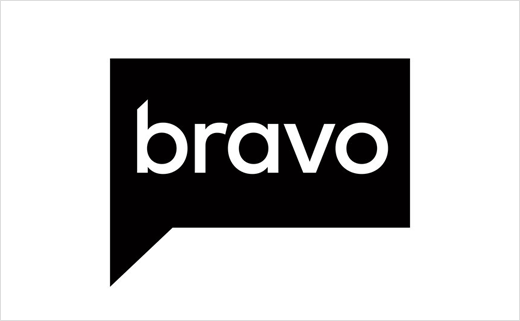
U.S. cable TV channel Bravo has unveiled a new logo design as well as a revamped "only on Bravo" jingle following an on-air and digital refresh.
Its speech bubble-inspired logo, with the letters now all rendered in lowercase, is part of a so-called "neutralised imaging" strategy, which company bosses say will attract more male viewers. The "...by Bravo" marketing tag will also be phased out from general use.
"The last time we changed our look was seven years ago, and our programming has changed since then and obviously life has changed, society has changed, and it was time to take a modern look at how we were presenting ourselves," says Amy Troiano, Bravo’s senior VP of creative. "We wanted to continue to appeal to our core viewers who love us and are loyal to us, but this was a chance to expand even to our casual viewers with a new look."
Although the Bravo logo is now a sleeker black-and-white version of the original bright blue one, Amy adds that staying true to the talk bubble shape was important. "We knew we wanted to keep that," she explains. "We didn’t want to lose it, but we were happy to see it change and modernise it."
The NBCUniversal-owned channel originally started life back in 1980. In recent times it has become synonymous with producing and broadcasting reality television-type shows – most of which are targeted at females.
Source: Bravo


