Final Logo Design Chosen for 2020 Tokyo Olympics
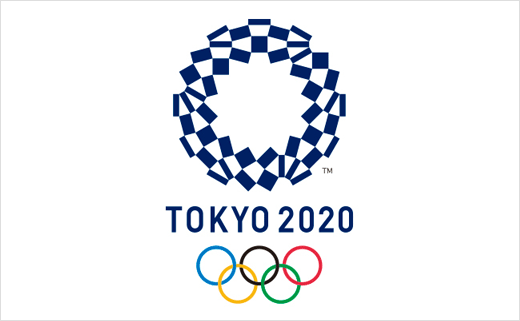
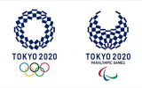
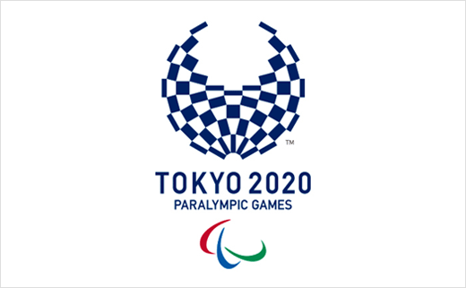
The official logo of the 2020 Tokyo Olympics has been revealed. Dubbed "Harmonised Chequered Emblem", the winning logo was selected from 15,000 entries submitted in an open-call competition.
"Chequered patterns have been popular in many countries around the world throughout history. In Japan, the chequered pattern became formally known as 'ichimatsu moyo' in the Edo period [1603-1867], and this chequered design in the traditional Japanese colour of indigo blue expresses a refined elegance and sophistication that exemplifies Japan," said an official Tokyo 2020 spokesperson.
Composed of three varieties of rectangular shapes, the design is claimed to represent different countries, cultures and ways of thinking.
"It took me a long time to create this logo – it's like my own child," said Tokyo-based designer Asao Tokoro, who created the winning emblem.
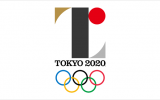
The original logo by Japanese designer Kenjiro Sano was ditched last year after allegations of plagiarism due to its similarity to the logo of a theatre in Belgium.
A special selection committee was subsequently established to select the new logo, which also has a corresponding design for the Paralympics.
Source: Tokyo 2020


