Graeter’s Ice Cream Reveals New Logo and Packaging Design
American ice cream brand Graeter's has revamped its logo and packaging design.
The brand, which has been around for 155 years and claims to be the oldest family-owned ice cream maker in the U.S., partnered with the design firm Dewhaus to create the new look.
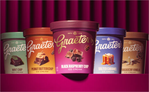
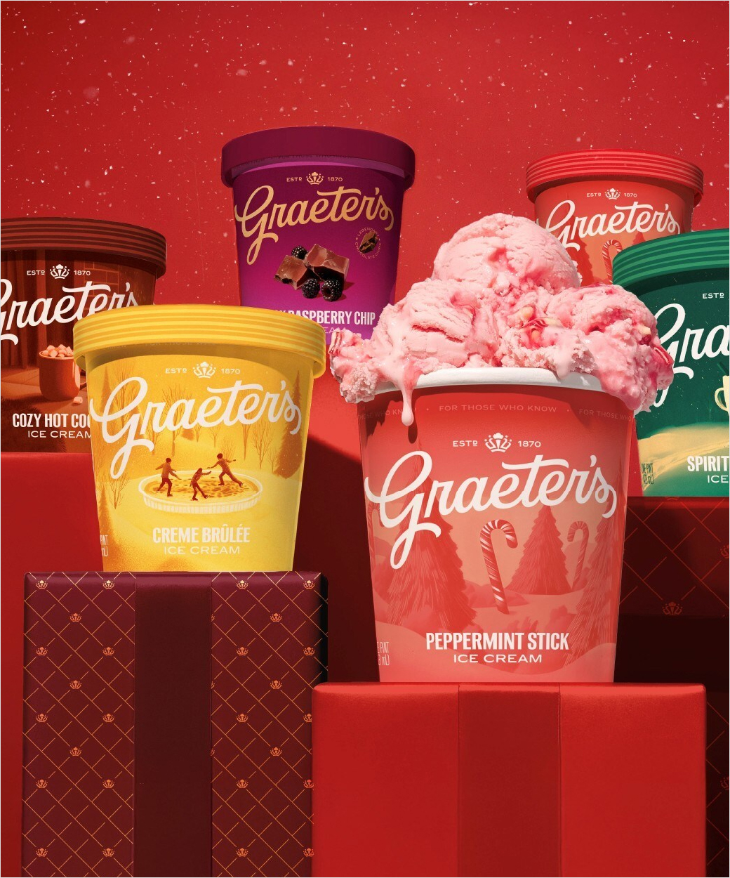
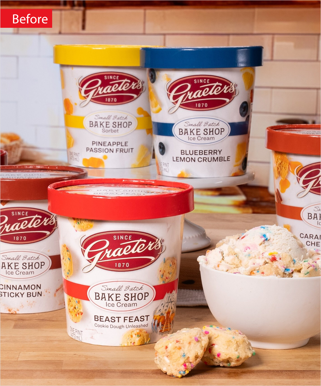
Changes include updated packaging that is said to express "joy, indulgence, and distinction"; a new colour scheme that reintroduces the brand's signature maroon; fresh patterns; and a crown icon that honours both Cincinnati, known as the Queen City, and Graeter's "royalty" in the ice cream realm.
The logo, meanwhile, maintains the traditional Graeter's script albeit modernised for better clarity and contemporary use.
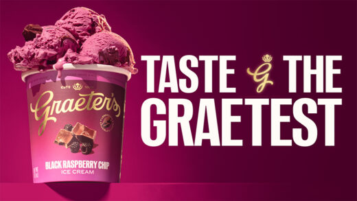
It is further paired with a new tagline, "Taste the Graetest".
"We've always believed that being the 'Graetest' means doing things our way – the right way – even when shortcuts exist," says Richard Graeter, fourth-generation president and CEO of Graeter's.
Adding: "Our rebrand honours everything in our past while confidently looking ahead to the next generation of ice cream lovers. We're setting the stage for the next chapter of taste."
The new branding will be launched over the coming year in ice cream shops, grocery stores, and through advertising.
Source: Graeter's


