Greenspace Designs New Typeface for Anthology
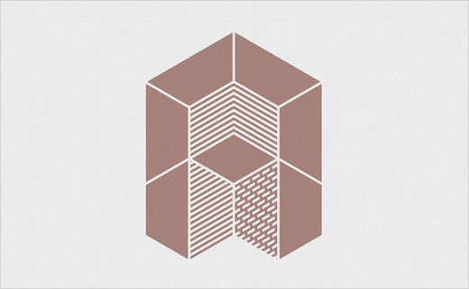
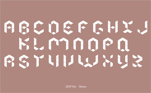
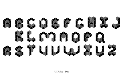
Greenspace has collaborated with letterpress printing studios New North Press and Thomas Mayo & Co. to create a bespoke new typeface, said to have been inspired by architectural forms.
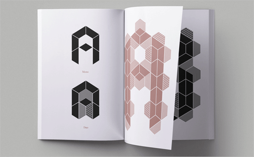
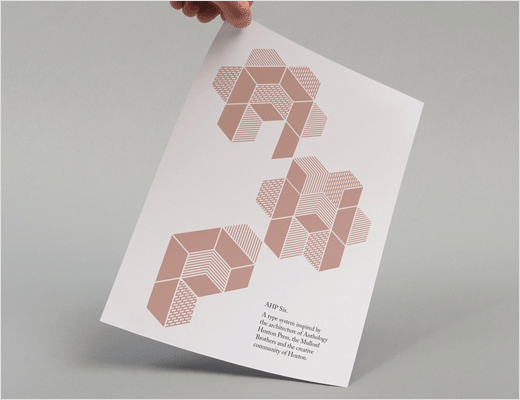
Named AHP Six, the type-system was created as part of an identity tool-kit for property developer Anthology's latest development in Hackney called Anthology Hoxton Press.
Designed by Karakusevic Carson Architects and David Chipperfield Architects, the building complex features two towers – dubbed "Mono" and "Duo" – that sit on the Colville estate, where former printmakers the Mullord Brothers created hand-crafted pieces back in the 1860s.
"It's this rich heritage, inspired by the buildings' unusual architectural forms that led to Greenspace developing the concept of a hexagonal type-system specifically designed for letterpress," explains creative director, Lee Deverill.
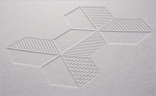
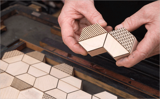
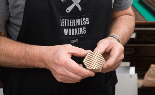
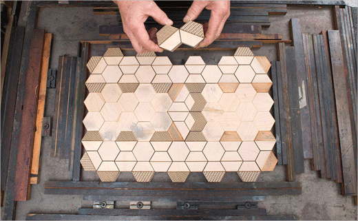
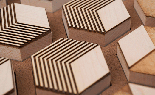
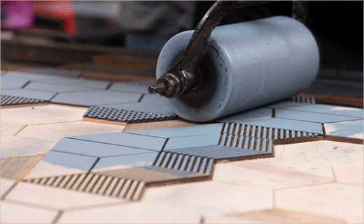
Produced by Thomas Mayo & Co. the blocks themselves are handmade at type-height from maple wood. Different textures and patterns have then been laser-cut to create a modular set that can be orientated and placed in many different ways on the press bed.
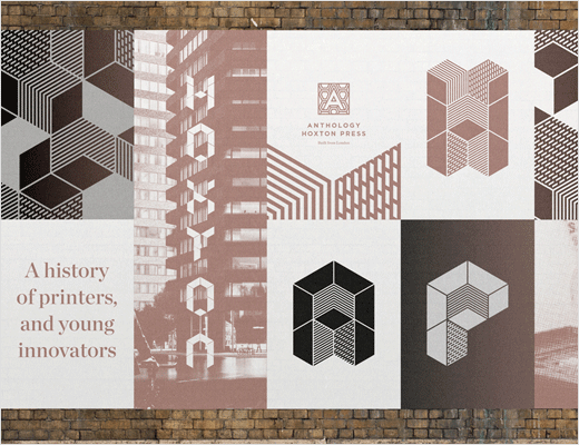
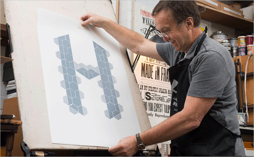
North Press then used the woodblocks to design and print an array of letterforms that can be small, large, minimalist or decorative. These prints will be used for Anthology communications such as their newly-opened sales & marketing suite.
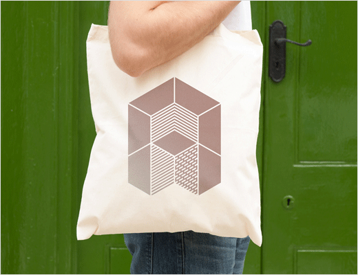
The typeface has also been used in promotional material and specially created screenprints in the new Anthology 'New Home' in Hoxton.
Greenspace
www.thegreenspace.com


