Pearlfisher Rebrands Taylors of Harrogate
Taylors of Harrogate has unveiled a full rebrand, which the over 100-year-old Yorkshire-based company says will bring to life its focus on "extraordinary flavour".
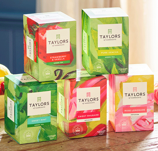
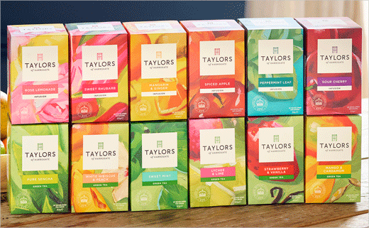
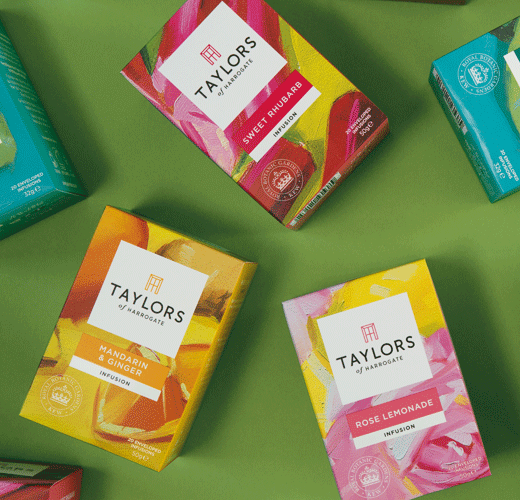
The new brand proposition, created with global creative agency Pearlfisher, includes the introduction of an evolved logo and new packaging designs across its tea and coffee ranges.
The refreshed logo, which has been brought to the forefront of all products, combines the letters T and H to form a window. The design aims to evoke the idea of "opening up a world of flavour, or peering into a home of revered expertise."
"The design was inspired by the fact that back in the 1930s, Taylors was based in a large terraced house where products literally came out of the front window," explain the designers.
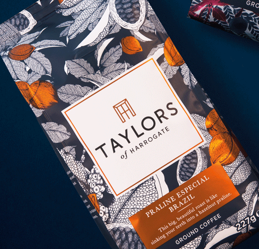
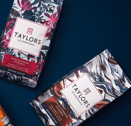
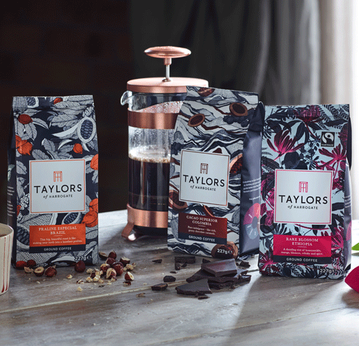
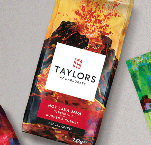
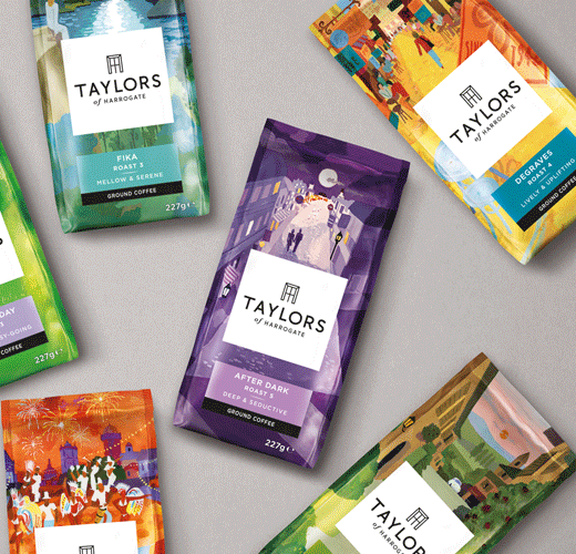
To further reflect the brand’s position on ‘craftsmanship’, Pearlfisher has centralised the packaging for each range around hand-drawn illustrations.
"By revising the brand’s focus from ‘craft’ – which has become a jaded concept in almost every category – to ‘craftsmanship’, we’ve brought the Taylors story of artistry, ‘makery’ and innovation to the fore with clarity and confidence," says founding partner and CEO of Pearlfisher, Jonathan Ford. "We commissioned artists from far-flung corners of the world to create the beautiful illustrations upon which the new aesthetics for each range are based".



Pearlfisher
www.pearlfisher.com


