Pentagram Designs New Logo for Houston Ballet

Partner DJ Stout and his team at Pentagram Austin have designed a new logo and identity for Houston Ballet. The reworked identity system is the first step in a process of rebranding the company, which was originally founded in 1955.
The organisation previously used a nondescript logotype and didn’t have a recognisable mark as such, so lead designer Barrett Fry and the rest of the Pentagram team say they made the creation of a distinctive logo a priority.
Set in a dark purple colour, the new design incorporates circular patterns inspired by the motion of dancers, while a cap letter "H," for Houston, is revealed in the negative space.
"The implied motion of the icon is representative of the energy and dynamism of athletic dancers starting from a standstill and building up momentum until they are gliding and spinning across the stage," says Stout. "The kinetic wheels express the energy of pulsating stage lights and they can also be seen as a troop of dancers in twirling tutus viewed from a bird’s eye view."
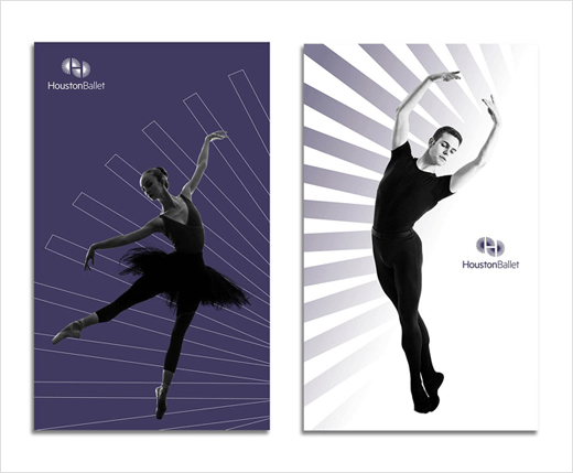
In addition, the Pentagram team has developed a system that uses segments of the logo’s radiating wheels as graphic devices in ads, banners, print collateral and other applications of the new identity. In that way the mark functions as an identifier across the spectrum of promotional materials and becomes an additional branding tool for the ballet.
The new wordmark, meanwhile, is set in Metric and the word “Houston,” which is the key element of the two words, is bold faced so the letterforms go from bolder to less bold, echoing the thicker to lighter, bolder to thinner configuration of the new icon.


Pentagram
www.pentagram.com


