Branding and Packaging for Fish Brand, ‘RR. Spink & Sons’
Scottish smoked fish brand and Royal Warrant-holder RR. Spink & Sons has unveiled a range of new-look packaging across its range, designed by UK branding and design specialists Good.
RR. Spink and Good’s new design showcases the premium positioning of RR. Spink – which has been smoking fish since the 1700s, and holds a Royal Warrant – with a packaging range that is contemporary, but that reinforces the craft and heritage central to the brand.
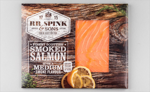
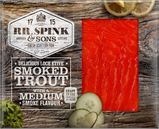
The previous light-coloured packaging has been replaced with a ‘wood effect’ pack, emphasising the brand’s heritage of smoking over wood and underlining the natural methods used in the product range.
These wood-effect packs also increase the brand’s on-shelf presence – the previous light-coloured design’s small font and lighter colours meant it lacked impact. The large ‘window’ through the cardboard outer showcases the product itself.
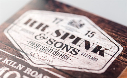
The brand’s new marque, in the top left corner of the pack also emphasises its Scottish provenance, naming the town of Arbroath, where RR. Spink is based. As an area of the UK famed for smoked fish (including the famous Arbroath Smokies), this further reinforces the brand’s credentials.
This marque also foregrounds the brand’s heritage, with the date of its founding in 1715, along with its Royal Warrant.
RR. Spink and Good’s new packaging covers the entire product range, from 150g to 800g packs for kiln roast and cold smoked salmon and trout.

Good
www.wearegood.com


