DixonBaxi and Anti Rebrand Opera Browser
For the last 12 months DixonBaxi have been working with Opera, the Norwegian-headquartered web browser and mobile technology business that is claimed to have 350 million users worldwide, to redefine their brand proposition, brand strategy and architecture.
DixonBaxi say they completed a four month research and insight gathering audit before going back to the internal brand team with relevant insights and directional thinking for the final strategy.
“With Opera positioned as an inventive and wide reaching business of great effect, but low on the publics radar, we felt the key was to create a strategy that was more consumer driven. A rally cry to be more active, inclusive and focused on the great things Opera liberate people to do. The strategy is – Do More. Opera allows people to get more of what the need, more out of their time and through powerful compression tools, more out of life,” says DixonBaxi co-founder, Simon Dixon.
While DixonBaxi was responsible for the overall brand and creative strategy, the visual identity itself was subsequently completed by Norwegian design agency Anti.
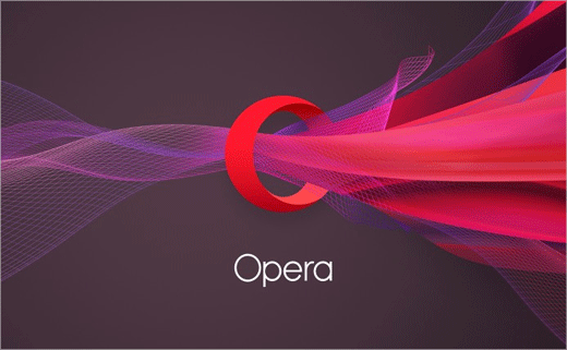
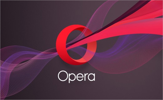
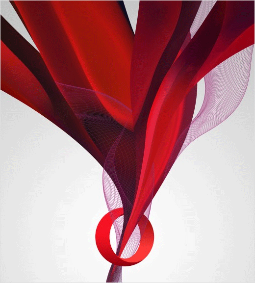
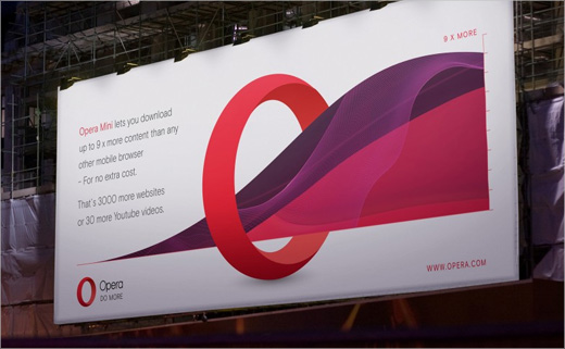
“The familiar red O is transformed into a logo that does more. The O becomes a portal that delivers infinite amounts of content to their users,” explain the designers.
DixonBaxi www.dixonbaxi.com
Anti www.anti.as


