DixonBaxi Rebrands AC Milan
London-based design agency DixonBaxi has rebranded European football giants AC Milan.
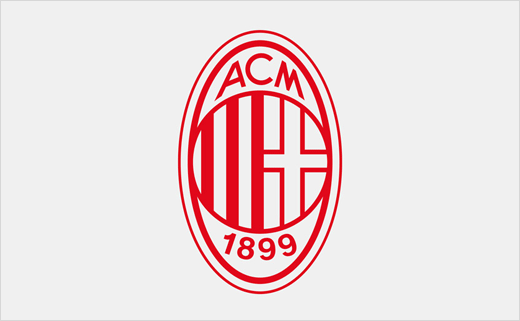
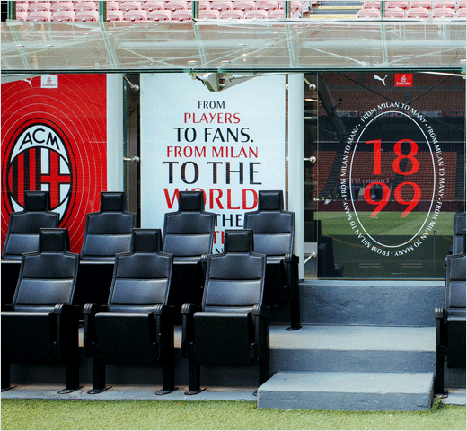
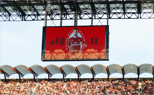
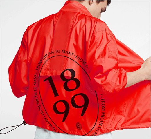
The refreshed visual identity system, which ties in with the start of the Serie A 2019/20 season, has been developed around the Rossoneri’s famous crest-shaped logo and is further claimed to go “beyond football and borders”.
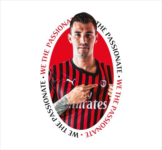
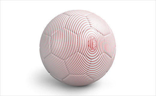
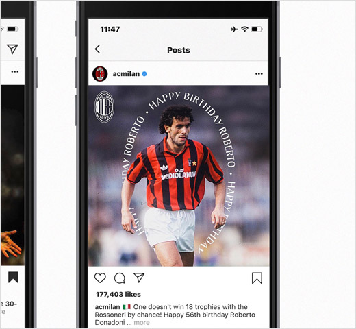
“Fans and footballing gods have been kissing the club’s famous badge for a century. Respecting this heritage, we left the design untouched and used the iconic oval shape to tell powerful stories,” explain the designers at DixonBaxi.
“The work has focused centrally on the club’s crest and badge, celebrating its history but reinterpreting it in a very modern way,” adds AC Milan’s chief revenue officer, Casper Stylsvig. “The central focus on the badge allows us to celebrate the red and black spirit and love for the club from fans in Milan and around the world.”
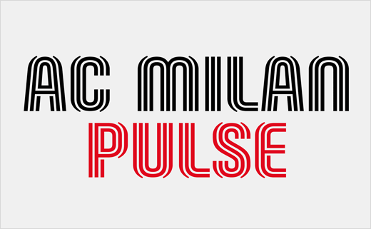
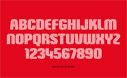
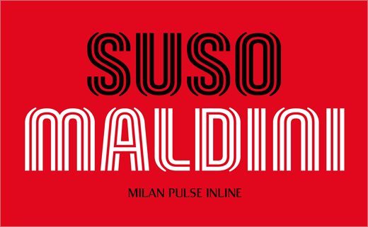
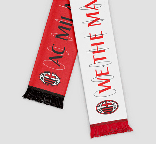
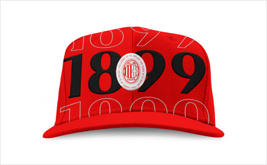
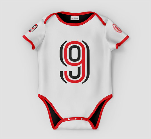
Although the logo itself remains unchanged, the club’s colours have been updated to a more vibrant red. Also new is a bespoke typeface dubbed “Milan Pulse Inline”.
“Taking cues from fashion, lifestyle brands and Italian culture, we created a bold yet elegant typographic system. Instantly recognisable, it captures the passion Milan fans have for their club,” says the design team.




DixonBaxi
www.dixonbaxi.com


