Interbrand Reveals New Logo and Identity for Juventus
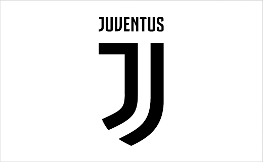
Interbrand has rebranded Italian football club Juventus, with a new look that is claimed will help the Serie A team go "beyond football".
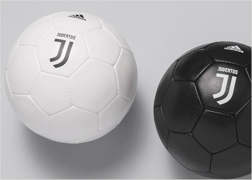
The new logo, featuring a stylised J symbol, is minimalist in nature, and does away with the traditional oval-shaped crest, including the latter's bull and crown symbols.
However, the Turin club's famous monochrome colours have been retained.
"The new logo is iconic and universal. It’s bold enough to make a statement, but flexible enough to appear alongside a wide range of new experiences—in the stadium and beyond," says the design agency. "By leaving the team’s defining black-and-white stripes untouched, Juventus is bringing the illustrious legacy and spirit of one of Italy’s preeminent teams to new audiences and die-hard fans alike."
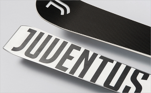
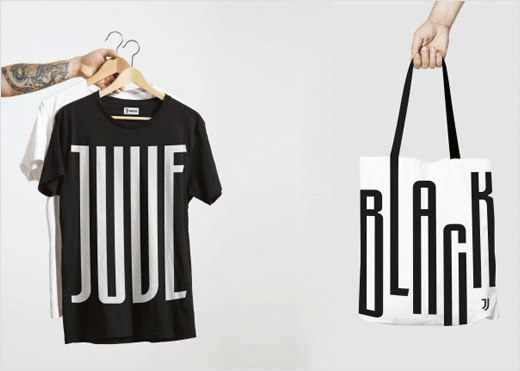
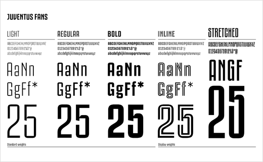
The Juventus wordmark, meanwhile, is set in a new custom typeface called "Juventus Fans", which has been developed in five different variants.
Created by Interbrand’s Milan office, the refreshed identity forms part of Juve's new brand strategy and business plan dubbed "Black and White and More".





Interbrand
www.interbrand.com


