New Sports Anti-Doping Body ‘ITA’ Reveals Logo Design

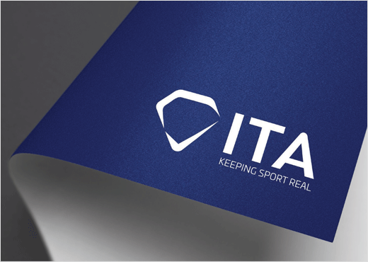
Following approval from its Foundation Board led by former French Sports Minister Valérie Fourneyron, the International Testing Agency (ITA) has revealed the logo and slogan, "Keeping Sport Real", which together will form the cornerstone of its brand identity.
Headquartered in the Swiss city of Lausanne, ITA is a newly-formed not-for-profit body that aims to provide anti-doping services to major sports organisations from around the world.
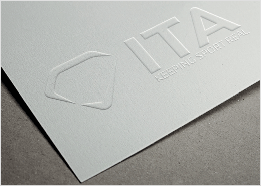
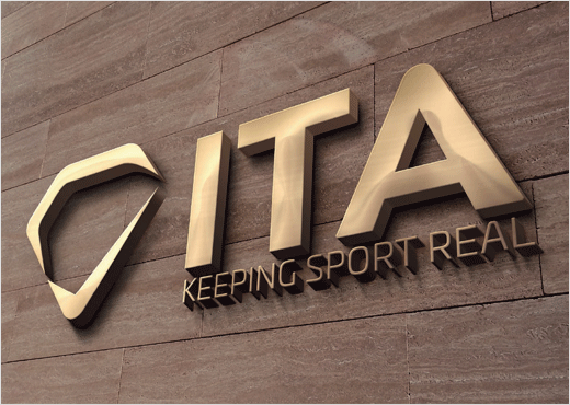
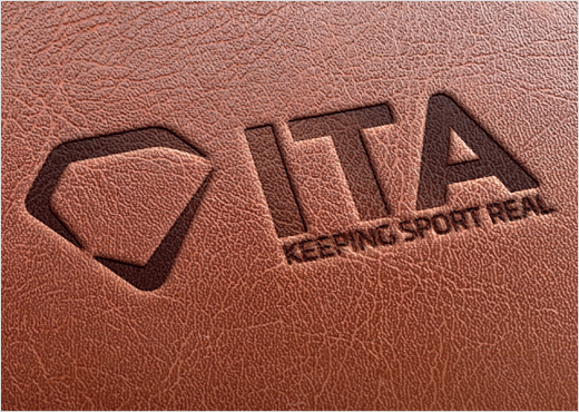
Created by JTA Design, the ITA logo features two graphical elements that come together to form a diamond, with the second element resembling a tick. The ITA slogan, "Keeping Sport Real", is locked into the logo.
"The logo design resonated with all of us here at the ITA thanks to the thinking behind it," says ITA director general, Benjamin Cohen. "The diamond shape conveys four qualities that are very important to us: there is a brilliance that fits perfectly with the essence of our work in helping deliver the brightest possible future for sport and its athletes. There is a purity that corresponds with the exceptionally high standards we have set for the ITA's work. The clarity matches the transparency with which the ITA will carry out its responsibilities, and there is a toughness that parallels our determination to protect athletes and our unbreakable commitment to clean sport.
"The second part of the graphic element is a tick, the universal symbol not just for passing a test but for truth, accuracy and even reliability."
ITA also claims it has received positive feedback from both current and former athletes regarding the new logo and accompanying slogan.
"It is important for us to demonstrate our strong and unique identity. The ITA's simple yet dynamic new logo and slogan helps us do just that," adds Cohen.


JTA Design
www.jta-design.com


