House of Commons Given New Visual Identity by SomeOne
Branding agency SomeOne has overhauled the identity system for the UK’s House of Commons.
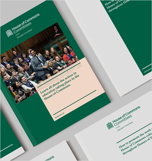
The old visual identity was produced back in 2009, with a focus primarily on traditional printed publications and stationery.
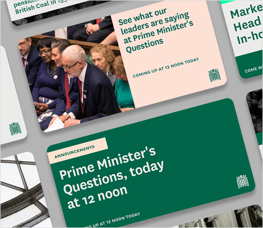
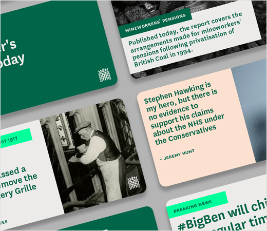
Other touchpoints, for example, procedural documents, signage, commercial or, importantly, digital applications – such as social media, apps or external sites – went largely unaddressed.
The design system had therefore become “inefficient” and its management “complex and challenging”, according to SomeOne.
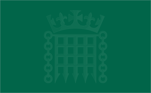
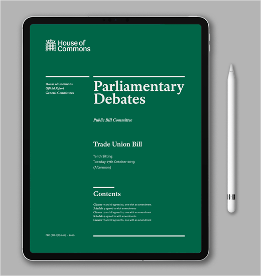
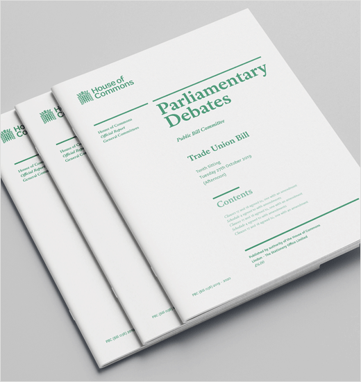
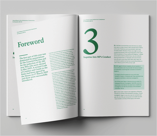
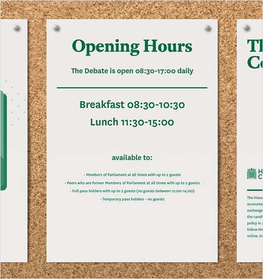
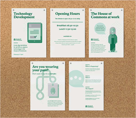
In contrast, the refreshed identity is claimed to be more digital-friendly and features a trio of portcullis designs, as well as a new typeface – dubbed “National” – that supports an adaptable wordmark system.
A new colour system has also been deployed, with the famous core green getting an update in order “to improve the contrast of elements and legibility of type in all formats”.
“The operating system we’ve developed for the House of Commons remains respectful of the past while welcoming current and future demands. Surrounding the central design elements are new aspects created to build greater engagement with the public and help them to stay in touch with the parliamentary landscape,” explains SomeOne’s design director, Cosmo Jameson.
“More traditional views of branding would have us believe we only need to rubberstamp a logo on things. The House of Commons has embraced a far more progressive approach in the development of a full suite of assets and behaviours. This has made it a more complex project, but a better and more long-lasting outcome,” adds Beth Baines, SomeOne’s senior account manager.
This latest project follows on from SomeOne’s redesign of the UK Parliament logo last year.

SomeOne
www.someoneinlondon.com


