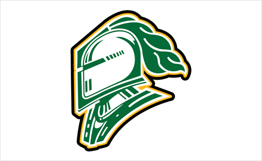
London Knights Reveal New Logo Design
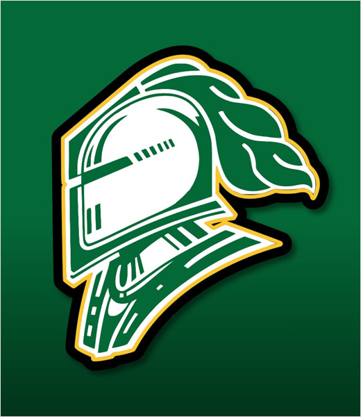
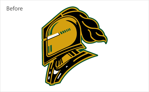
As the London Knights prepare to begin the 2019-2020 season, the Canadian junior ice hockey franchise has unveiled a new logo design.
The latter will now become the 10th in the team’s history, including the change from the London Nationals to the London Knights all the way back in the 1968-1969 season.
The Ontario club says the new helmet design has been inspired by previous iterations of London Knights logos. This specifically includes the 2002-2008 era logo, which was originally launched when Dale Hunter, Mark Hunter, and Basil McRae became owners of the team.
Since the Hunters took over the franchise in 2000, they have changed the logo of the team three times, moved the team downtown into what is now know as Budweiser Gardens, won four OHL Championships and brought the city of London two Memorial Cups.
“This is the tenth logo that we’ve had in the history of the London Knights,” explains London Knights owner, vice-president, and general manager, Mark Hunter. “Having the 2005 Memorial Cup Champions named as the Team of the Century, and being able to celebrate that accomplishment last season was another major inspiration for the design of this new logo”.
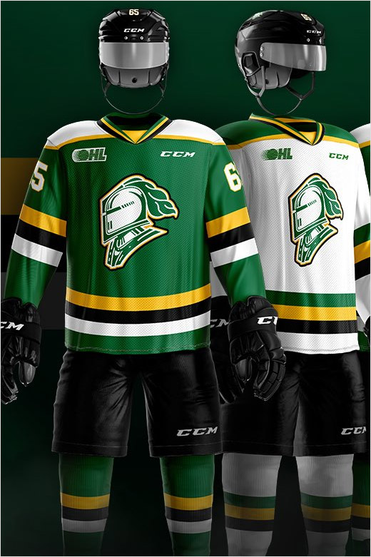
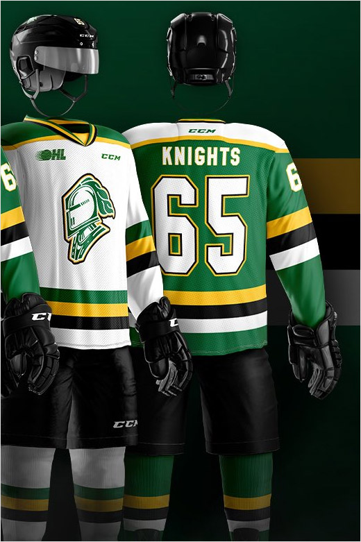
Like the revamped logo, the design of the club’s new jerseys also turns back the clock, echoing the colour scheme of the team’s uniforms from the late 80’s and early 90’s.
Source: London Knights


