U.S. Soccer Reveals New Logo Design
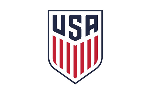
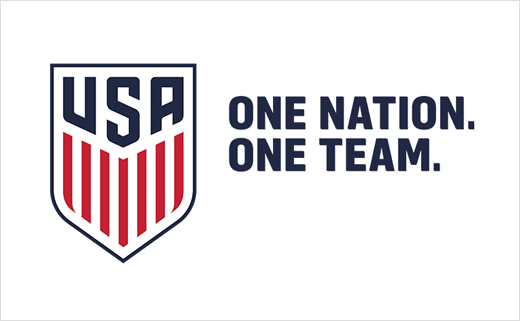
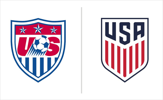
The U.S. Soccer Federation has unveiled its new logo design. The crest receives the first update since 1995. Key visual elements include stripes and colours drawn straight from the American flag.
In addition, the football organisation revealed its official font, 90Minutes, a custom look designed by typeface designer Tal Leming to go with the lettermarks used in the crest and allow for the integration of text with the crest.
The process of the rebrand began about two years ago with U.S. Soccer providing input and insight to the design team at Nike.
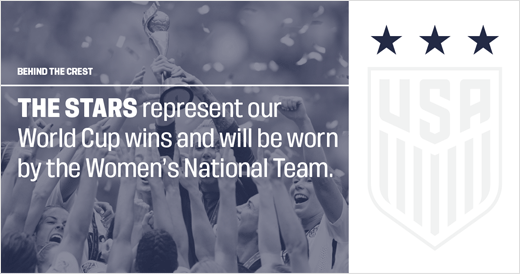
Notably, the new identity no longer features stars or a ball. In football tradition, stars are placed above the logo to represent World Cup victories. However, the Women’s National Team (WNT) crest will feature the three stars earned in 1991, 1999 and most recently, the 2015 victory.
The new crest also does not include the soccer ball that has been featured in the past two iterations.
Source: U.S. Soccer


