Dove Men+Care Deodorants Get New Packaging Design by JDO

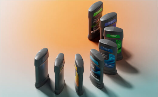
Dove Men+Care has introduced a completely revamped appearance for its deodorant collection, designed by JDO.
The makeover is intended to support parent company Unilever's objective of making the product line the "#1 skincare deodorant in the world".
"To achieve this, Dove Men+Care needed packaging that not only commands attention but also simplifies navigation and reinforces its premium positioning," says the design team at JDO.
Adding: "At the heart of the redesign is Confident Simplicity – a creative principle that fuses a clean, impactful approach with the boldness to stand out."
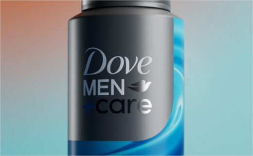
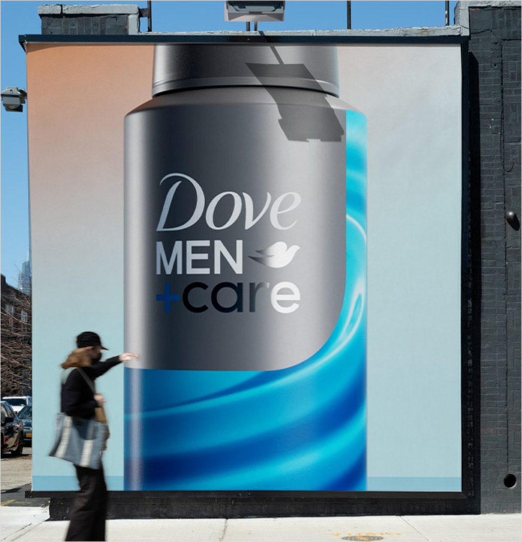
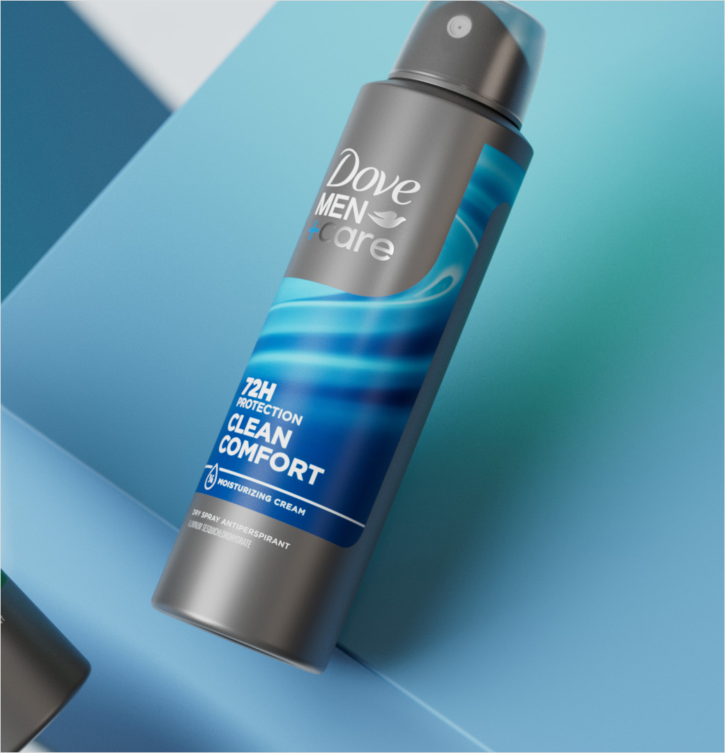
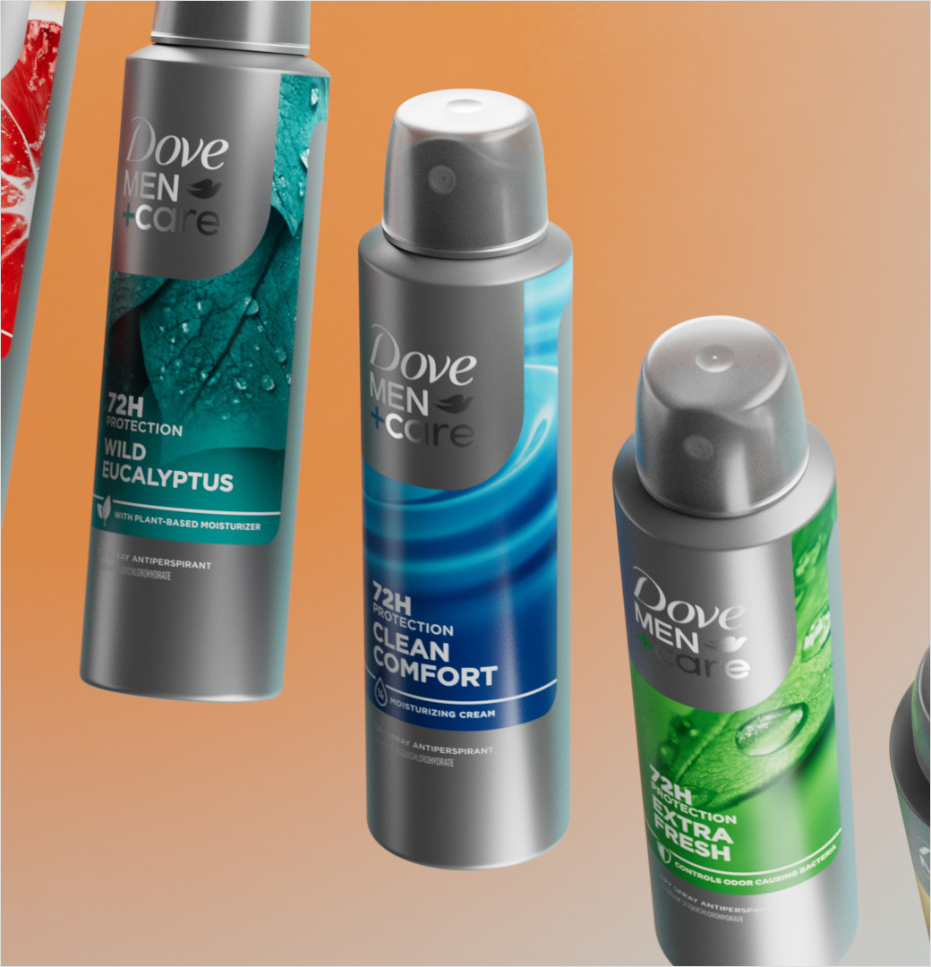
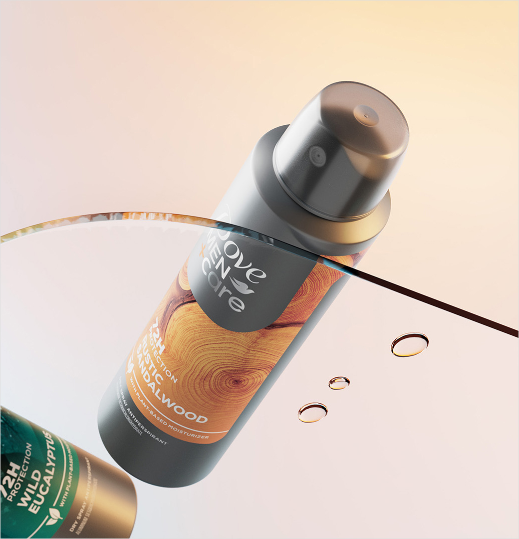
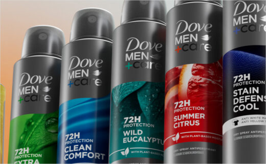
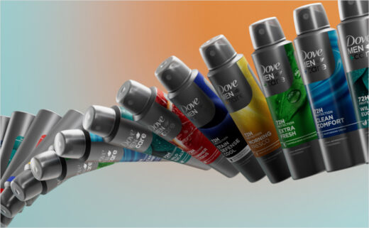
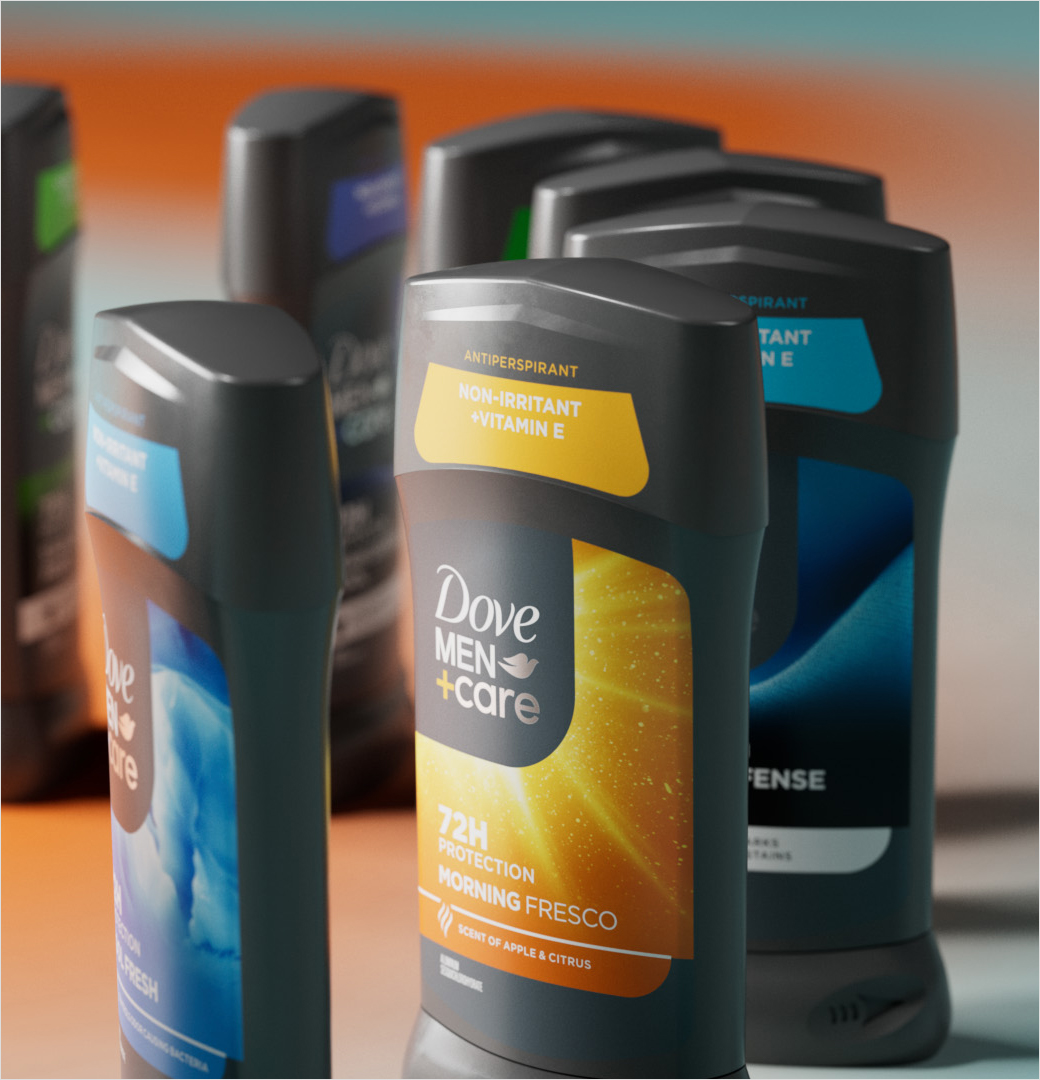
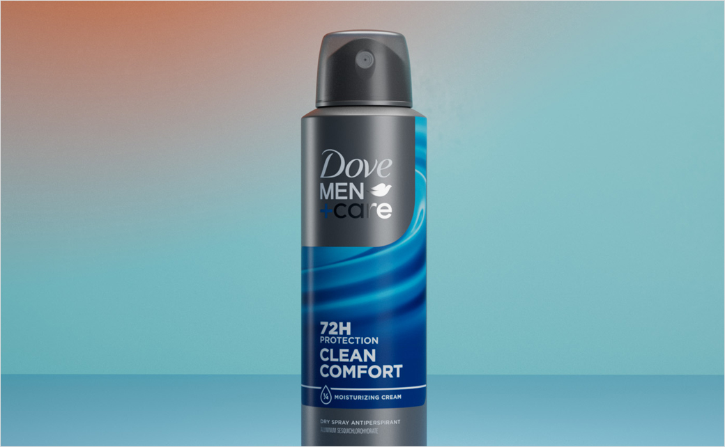
The packaging update features a new visual system, defined by a curved branding element that frames the Dove Men+Care logo against a graphite grey background.
"Our challenge was to create a look that’s as purposeful as it is striking," explains Ray Smith, creative director at JDO. "The curved brand asset on a clean graphite-grey backdrop gives the brand’s logo a strong, consistent home, while the bold macro imagery celebrates the vast range of products across multiple formats."
Additional details include macro photography that highlights elements of nature in vibrant colours, which serves to draw attention to specific details and showcase the unique benefits of each variant.
"This packaging refresh encapsulates the essence of Dove Men+Care – combining care, confidence, and connection into a design that is both meaningful and visually compelling," comments Unilever's Dennis Chua, who serves as associate director at Dove Men+Care Deodorants.
The refreshed packaging design has started rolling out globally.
