Domino’s Pizza Reveals New Logo and Packaging

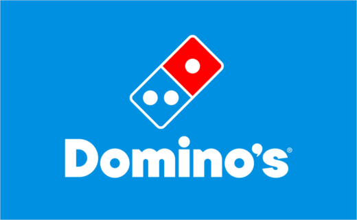
Domino's Pizza has completed its first significant rebranding in almost 13 years, introducing a refreshed logo and new packaging.
The famous pizza chain claims that this new identity is intended to shift consumer focus towards its pizzas rather than its reputation as a technology firm.
Changes include brighter versions of the brand's iconic blue and red colour scheme, along with a new custom font called "Domino’s Sans", which is described as "thicker and doughier" than the previous font, featuring "perfect circles and semi-circles as a nod to pizza".
To achieve a more 'premium' appearance, a black and metallic gold version of the Domino’s logo is also present on the boxes for the brand's signature Handmade Pan and Parmesan Stuffed Crust items.
The rebranding also introduces a new jingle, referred to as "Cravemark", created by Grammy-nominated artist Shaboozey.
"Most companies rebrand themselves when they're struggling, but after years of category-defying growth, this refresh is about continuing to push to be the best version of ourselves," says Kate Trumbull, Domino's executive vice president and global chief marketing officer. "It's vibrant, it's bold, and it's fun. It's pizza!"
Domino's began selling pizzas in 1960 and now runs over 21,500 stores globally, including over 1,000 restaurants in China.


Source: Domino's Pizza


