DS.Emotion Unveils Rebrand for Silverstone
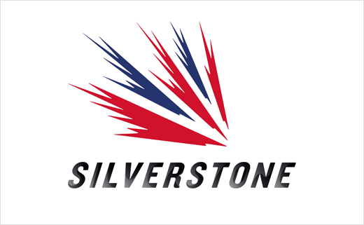
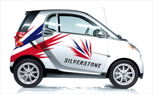
DS.Emotion has created a new visual identity for motorsport venue Silverstone, as part of a rebrand, which the design agency says "aims to align the brand with innovation".
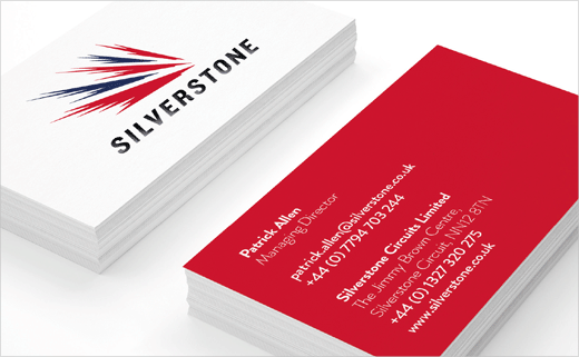
The new branding includes a revised speedmark logo, which was originally launched back in 2001 having been designed by Carter Wong.
"Silverstone has retained the brands speedmark but this has been sharpened to give cleaner lines and make the logo more three-dimensional," explain the designers.
"The speedmark symbol has been under utilised and disappeared from much of the identity application. But this mark symbolises the essence of the brand," adds Tom Heaton, creative director at DS.Emotion Manchester. "The first step was to clarify the speedmark and how it works with the font we created."
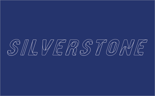
The typeface – drawn by hand before being applied digitally – is said to have been inspired by the racing line that runs through all the letters, with the goal being to create a "three-dimensional" effect.
Silverstone says the new brand has "an inherent simplicity and understated confidence" and is designed with "bold, iconic and effortlessly simple design cues."
A new website is also being redesigned by DS.Emotion and is set to go live later on in the spring.


DS.Emotion
www.dsemotion.com


