Free The Birds Redesigns Sunday Riley’s In-Store Logo and Branding

Beauty brand Sunday Riley has unveiled a new visual identity for its in-store retail displays with design by Free the Birds.
Originally established in 2009, the American skincare company's products are currently stocked in major retail stores across the globe.
"Sunday Riley is a hugely successful brand, but it needed a recognisable, seamless brand aesthetic in its physical retail spaces," says the design team at Free the Birds.
“In the physical retail world, you’re literally surrounded by competitors – sometimes on the same shelf – so capturing people’s attention is incredibly challenging,” adds Nick Vaus, the agency's creative director.
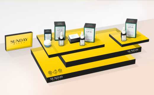
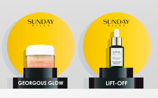
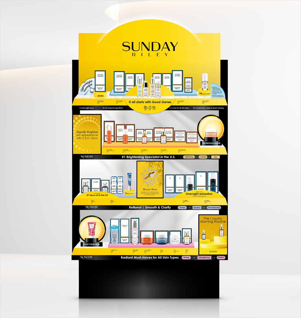
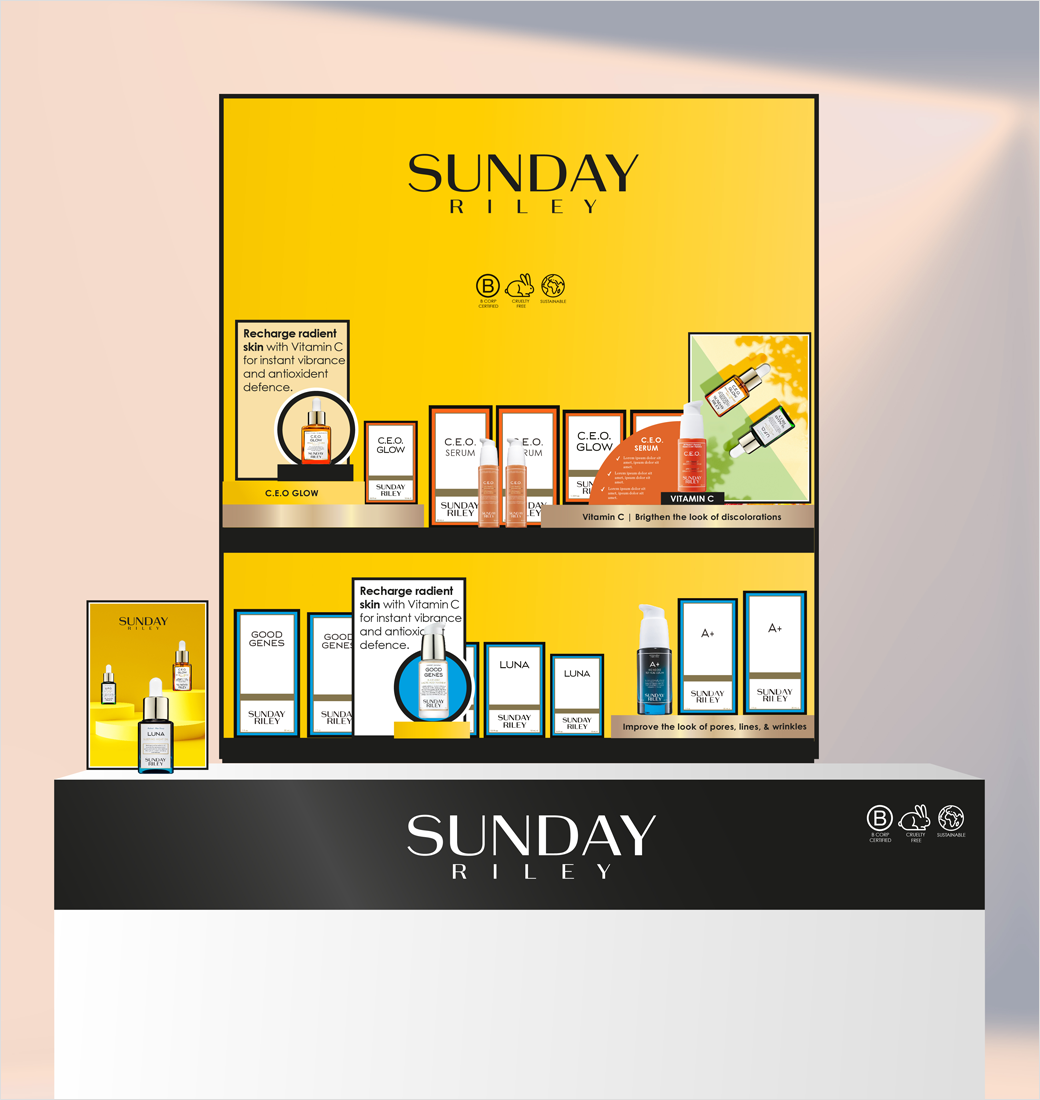
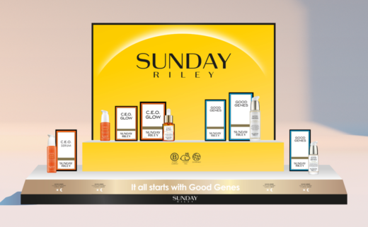
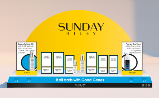
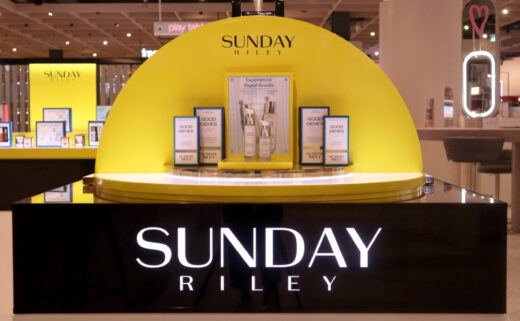
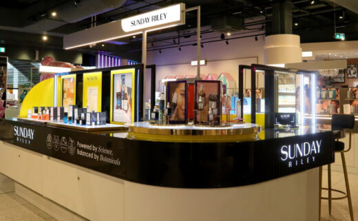
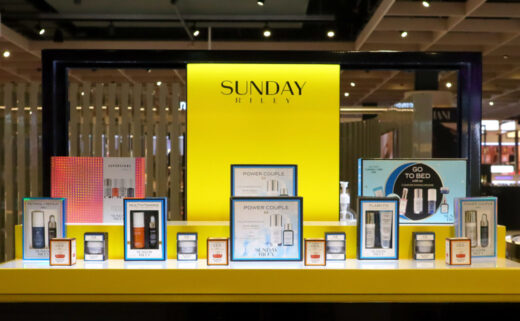
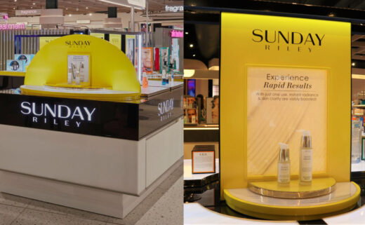
The refreshed identity therefore sees the introduction of a new hero colour, namely, "sunshine yellow", which is then combined with an equally new brand icon – "The Daily Sun".
The latter subsequently features as a motif throughout the various displays, including in the merchandise architecture and gondolas.
In an effort to further catch people's attention, the existing logo for all of the in-store touchpoints has also been modified, by shifting focus towards SUNDAY and reducing the size of RILEY.
Additional details include yellow acrylic plinths and pedestals to help elevate key products, best sellers, and promoted ranges.
"Sunday Riley’s retail displays will now be true beacons of light, giving the incredible product range the attention it deserves within stores," comments Vaus.




Free the Birds
www.freethebirds.com


