Free The Birds Updates Logos and Packaging for Sanofi Cough Brands
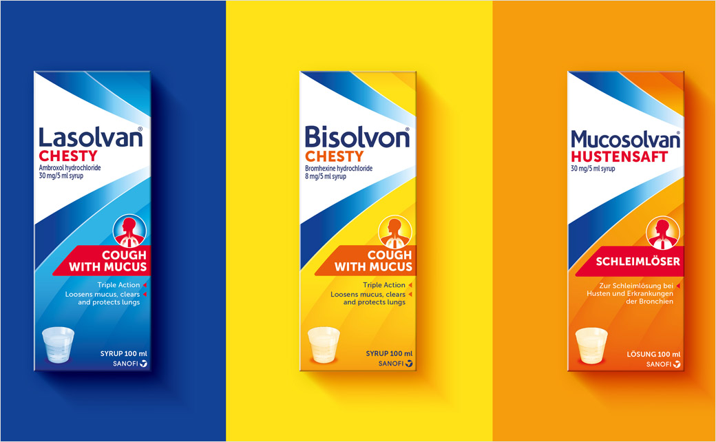
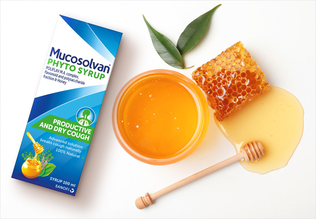
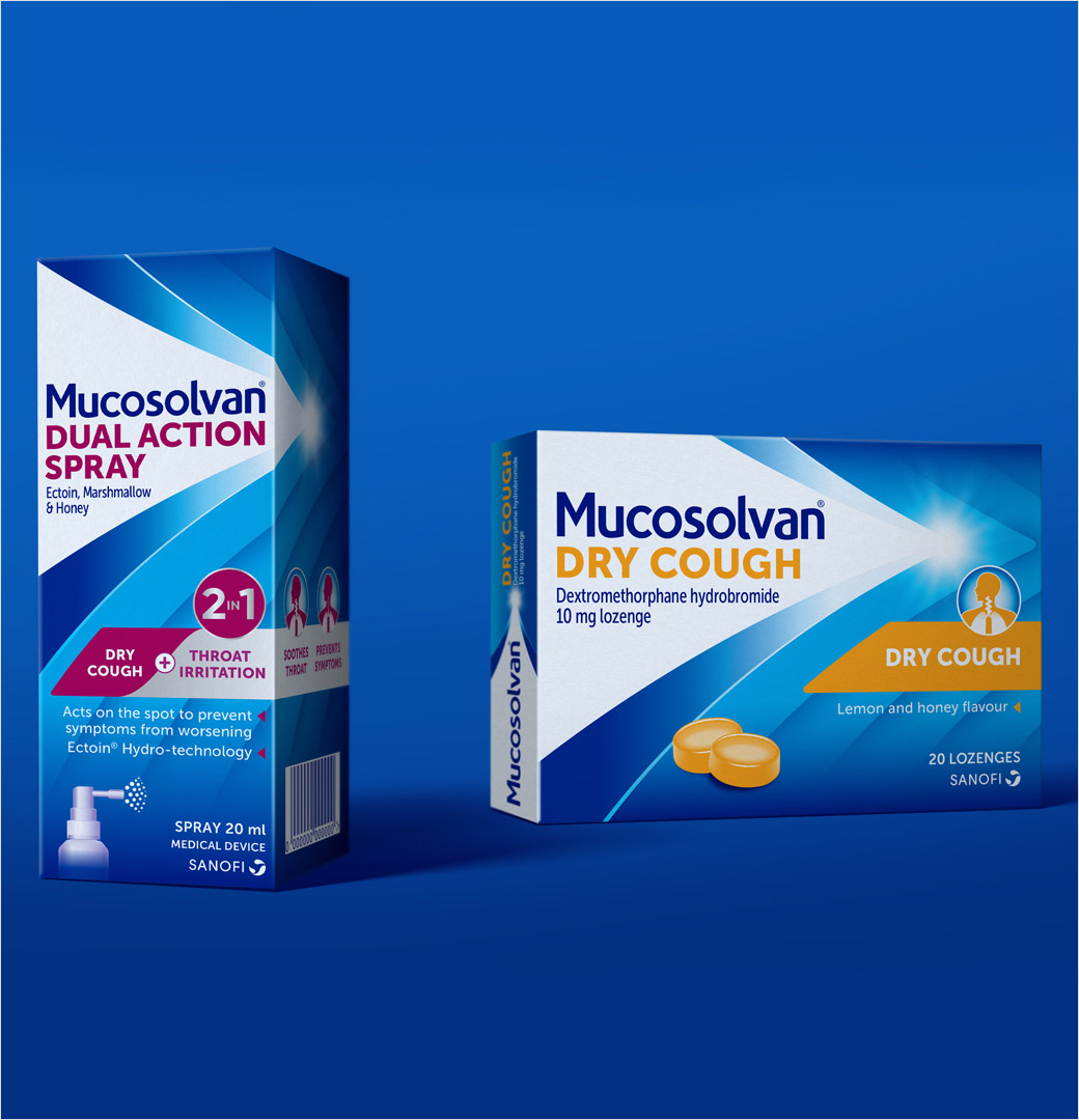
Free The Birds has created the new look for Sanofi’s cough brands, Bisolvon and Mucosolvan, uniting them for the first time under a single brand identity.
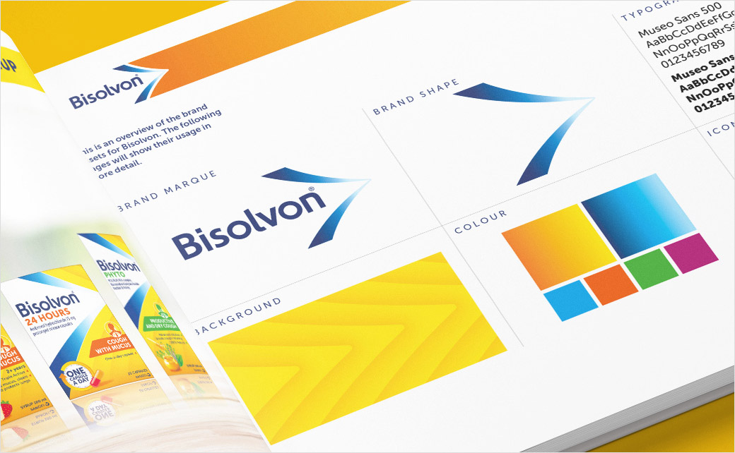
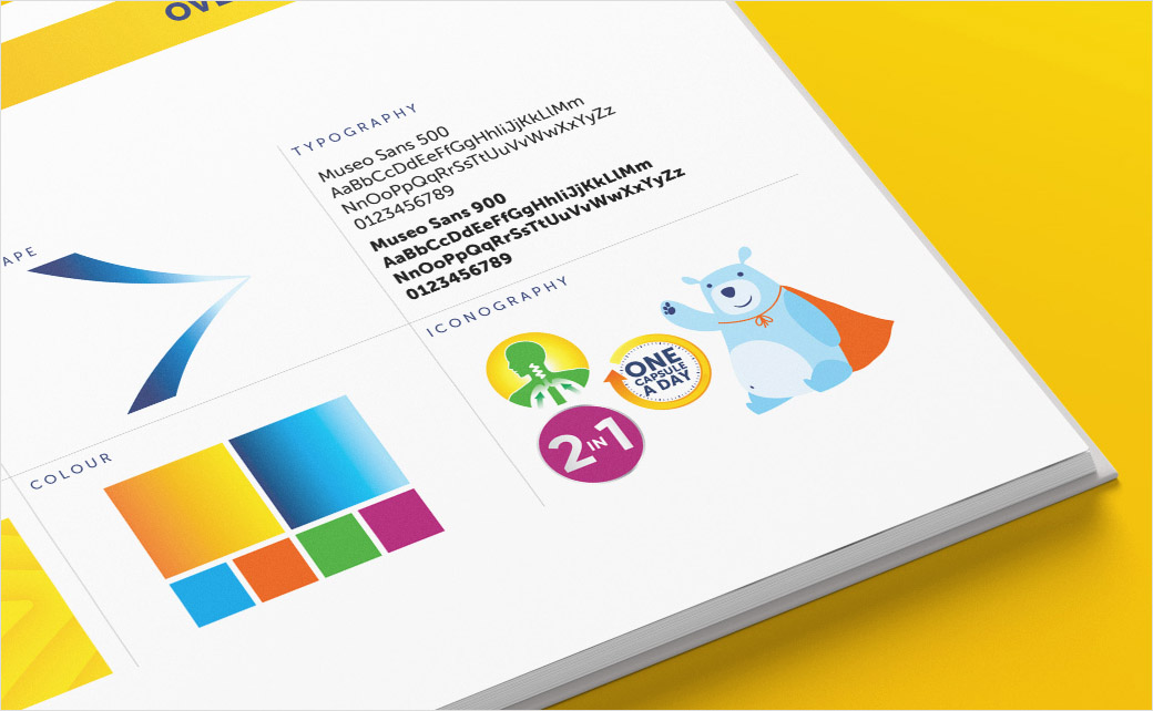
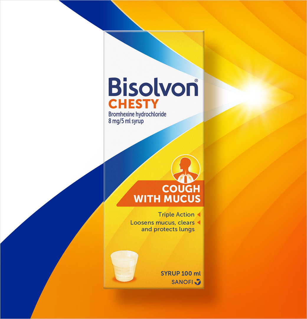
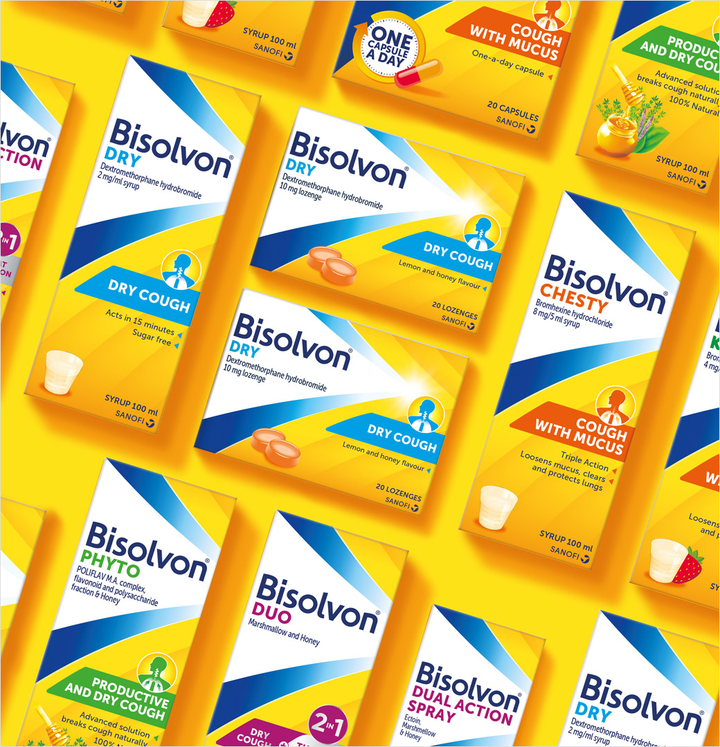
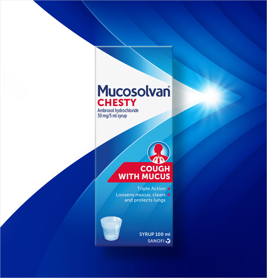
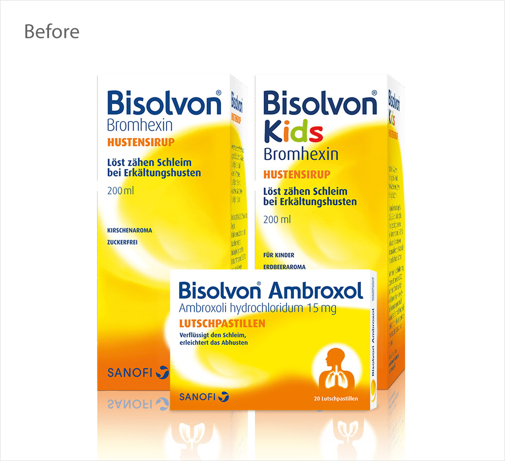
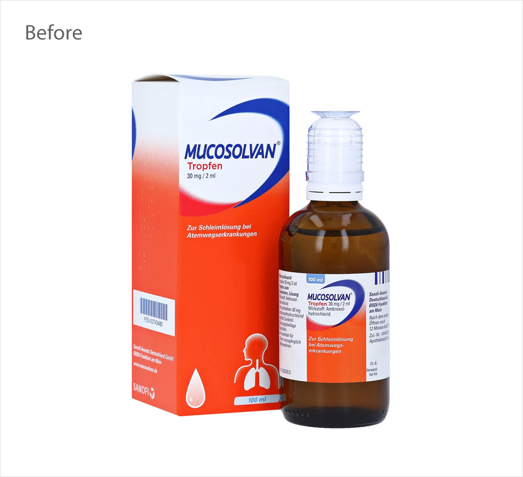
As part of the refresh, each product gets an updated logo as well as a new pack layout featuring revisions to both typography and iconography.
The new design is claimed “to better communicate the efficacy and purpose of the product, to aid pharmacist and customer decision making.”
Already distributed in five markets including Australia, Netherlands, Turkey, Russia, and the Philippines, the cough products are set to launch in Africa, Europe, and South America later on this year.
“We wanted to create a commonality in the packaging across all the regions, in order to ensure people identified them as Sanofi brands straight away, no matter the location,” says Nick Vaus, partner and creative director at Free The Birds.
Despite the changes, the brands’ have retained their heritage colours of blue and yellow, while the decorative curvatures of the original packaging design have transitioned into a multi-layered arrow “to illustrate the quick recovery process that the cough treatment offers.”
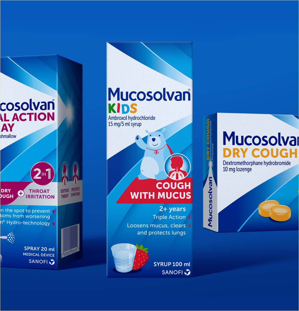
The creative agency has also introduced “Bearsolvan”, a playful bear character, to all children’s packs.
“The trend for healthcare brands is to retain a clinical exterior. But Sanofi is an established caregiver known for easing suffering from colds and coughs, which is what we aimed to encapsulate through Bearsolvan,” explains Vaus.
The new brand identity and packaging design follows the reveal of Sanofi’s new logo earlier this month.
Free The Birds
www.freethebirds.com


