Hydrafacial Reveals New Logo and Packaging Design by Free The Birds
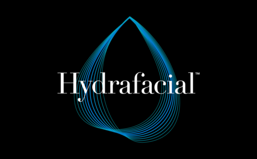
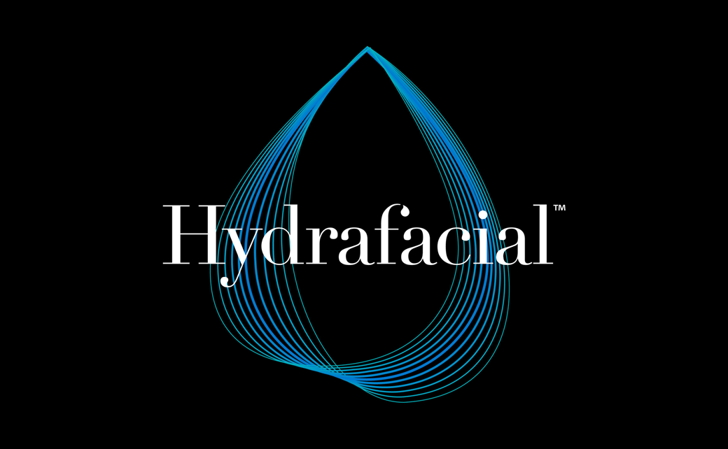
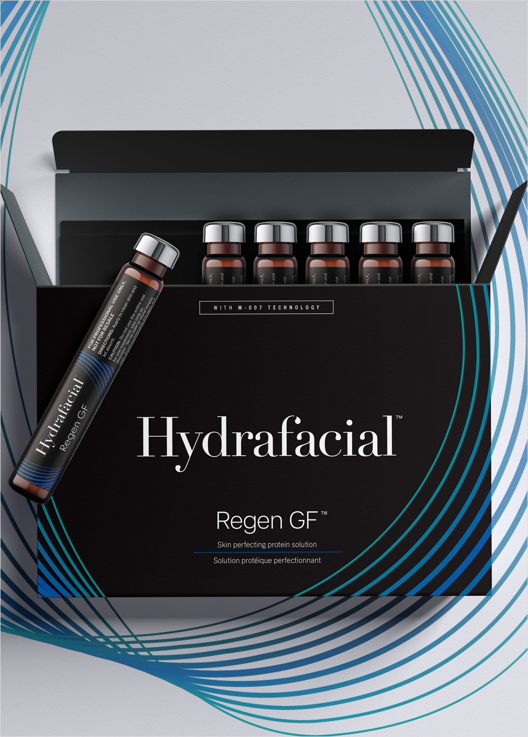
Beauty and aesthetics brand, Hydrafacial, has unveiled an all-new look, with design by creative agency Free The Birds.
Owned by California-headquartered BeautyHealth, Hydrafacial is effectively a non-invasive hydradermabrasion treatment, which is performed by a professional esthetician using "a patented vortex fusion device" in order to improve skin health.
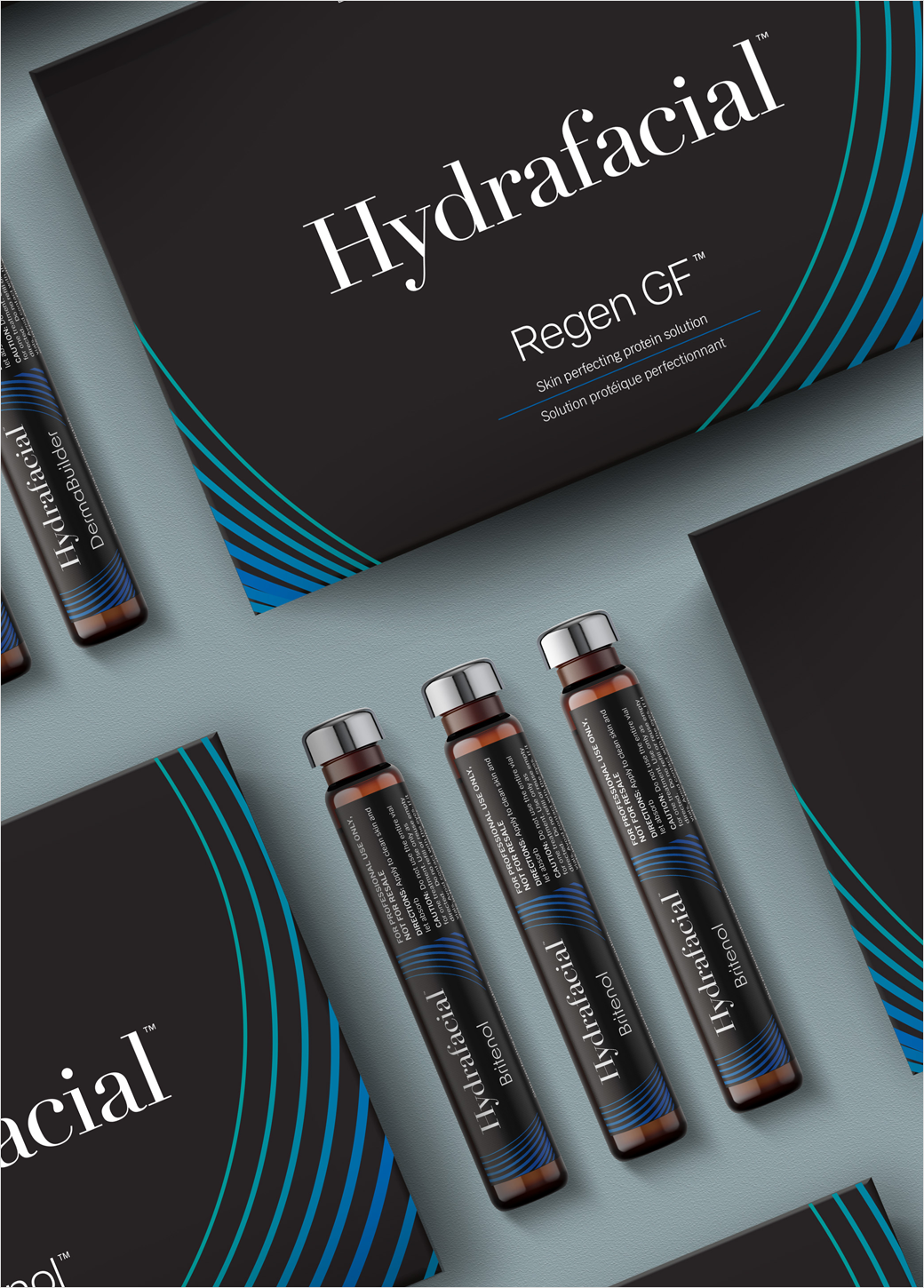
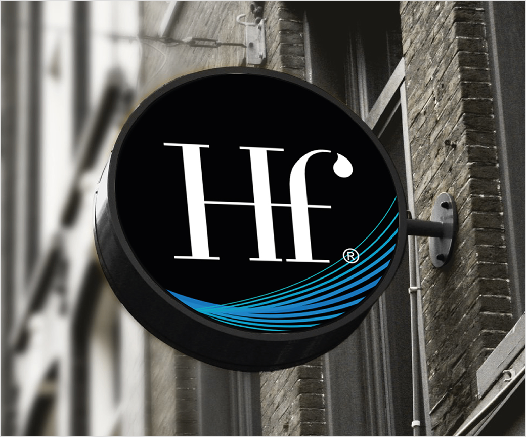
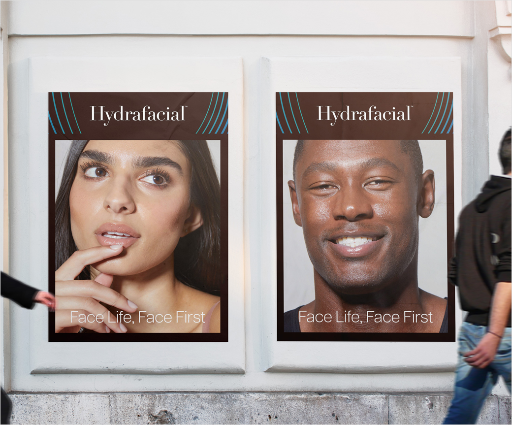
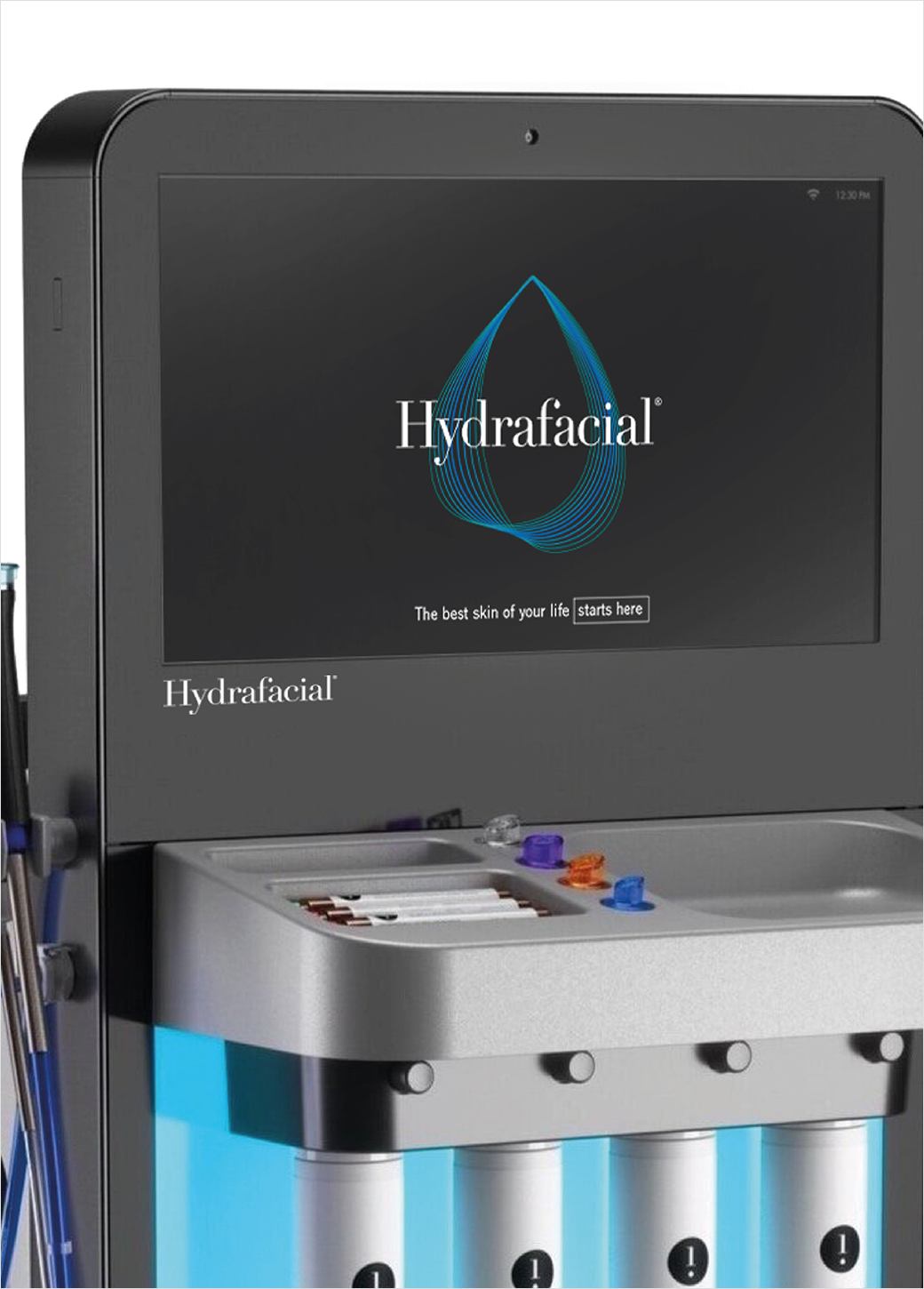
The new branding, which encompasses a refreshed logo, visual, and verbal identity, aims to raise the reputation of Hydrafacial’s product offering across both B2B and B2C markets.
Free The Birds' design team claims to have elevated and matured the brand's appearance in a way that it will now be perceived as being both premium and accessible at the same time, in the minds of businesses and consumers alike.
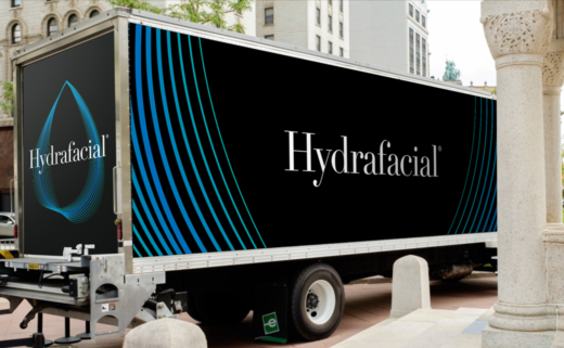
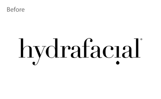
"Hydrafacial’s logotype was elevated by tweaking the positioning of the water droplet found in the upside down 'i' of the original, to slip it into the curvature of the 'f' in the new logotype," explain the designers, who have also introduced a new hero visual in the form of a pulsating droplet that "descends in a cascade of blue hues to bring depth to each brand touchpoint".
"Hydrafacial brand awareness is booming in countries around the world, so we had to ensure that the brand identity retained recognition in an elevated way that is transferable globally," further comments Matthew Gilpin, design director at Free The Birds.
"We wanted the brand look and feel to grow with us, but also ensure that our community of estis, partners and consumers still recognise us," adds BeautyHealth president and CEO, Andrew Stanleick.
The new look has already started rolling out across multiple touchpoints and is expected to be fully complete by the end of this year.
Free The Birds
www.freethebirds.com


