Gloucester Rugby Unveil New Logo Design
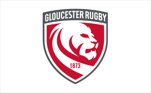
Gloucester Rugby are re-branding and changing their logo, following an almost year-long review which is said to have included interviews with both staff and players.
The Premiership club's CEO, Stephen Vaughan, officially announced the change at an event held earlier this week at Kingsholm Stadium.
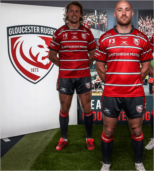
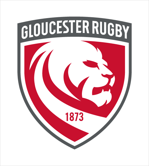
Key details of the new shield logo include a refreshed and modernised lion symbol as well as the inclusion of the year the club was founded, namely, 1873.
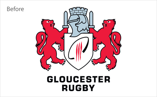
"During the process of looking at our brand values and brand tools, it became clear that our current logo is not fit for purpose going forward. The logo was first changed when the main stand [Mira Showers Stand] was completed in 2007. It had been until then the original Gloucester city crest, but was changed to a hybrid of the city crest with some rugby references added in. The result is a logo that doesn’t do either job: it isn’t the City crest and it doesn’t have any real identity or stand out from the crowd amongst its peer group. It is essentially a bit of a halfway house and is not easy to use commercially or digitally," said the club in an official statement.
"As social and digital media has grown, Gloucester Rugby needed to further evolve its brand to ensure the Club has the right tools for the future. Whilst there will be lots of focus on the change of logo, this project has encompassed so much more including the development of our brand values, new brand guidelines and a new look for all communications for Gloucester Rugby," added the club's marketing boss, Helen Roe.
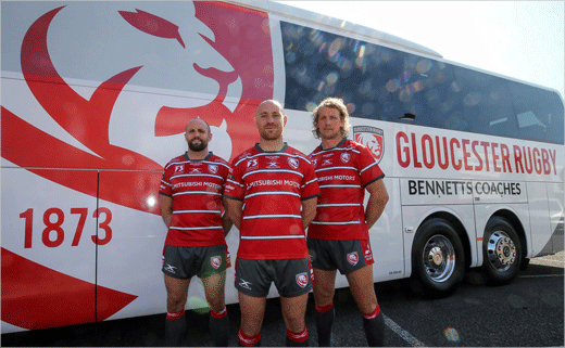
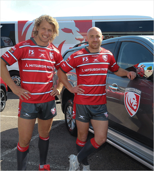
The roll out of the new logo and identity, which also encompasses a new home kit and redesigned club website, has already begun and is expected to be completed by the start of the 2018-2019 season.
Source: Gloucester Rugby


