I.T. Specialist BlueAlly Unveils New Logo
I.T. services and solutions provider, BlueAlly, has completed a brand refresh that includes a new logo and website redesign.
The new look is said to come off the back of a period of growth and expanded capabilities fuelled by a number of recent acquisitions.
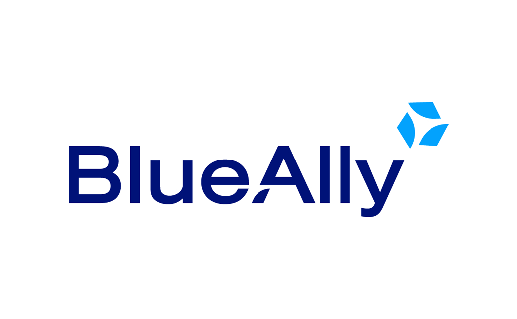
“The centrepiece of BlueAlly’s new look and feel is our flywheel logo, which signifies a constant drive toward building momentum – both for ourselves and for those we serve,” says the company’s chief marketing officer, Jonathan Berger.
The ‘A’ in the BlueAlly wordmark also contains a supporting element that mirrors the blades of a flywheel.
The visual identity is said to have been inspired by Jim Collins, the author of Good to Great, who describes the concept of the flywheel in a business to mean a state where the various aspects of a company feed into one another, creating a momentum that continuously builds upon itself.
Additional design details include a revised colour scheme featuring a deeper blue that is claimed to represent “strength and maturity”, alongside a lighter blue that symbolises “insight and clarity”.
“This brand revitalisation embodies our commitment to driving innovation, accelerating growth and propelling our clients and partners towards lasting success – all while walking with them as their ‘ally in next’ and guaranteeing the same exceptional service they’ve come to expect from BlueAlly,” further comments Berger.
Headquartered in North Carolina, the firm was originally founded in 2013 and now reportedly employees 450 workers with over 10,000 clients.


Source: BlueAlly


