Nationwide Building Society Unveils New Logo and Branding

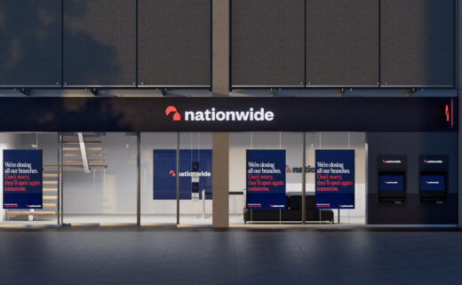
Nationwide Building Society has this week revealed an all-new look that is set to be rolled out across its network of 605 UK branches.
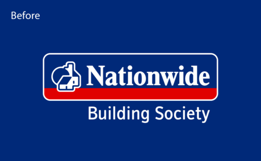
The modernised rebrand, which has been created by communications and customer experience agency New Commercial Arts (NCA), is said to be Nationwide’s most significant visual overhaul since 1987.
In addition to the new logo and updated visual identity, the refresh also sees the introduction of a new brand promise – ‘A Good Way to Bank’.
"The Nationwide brand is a special one, and it now has a look and feel to match – strikingly modern, refreshingly simple, yet still so familiar. We’ve gone through the design archives at Nationwide and recalled some beautiful elements from their history, while at the same time creating a new brand that is fit for the future," says Rob Curran, customer experience founder at NCA.
The new logo design is claimed to both modernise and simplify the Nationwide icon, while the accompanying bespoke typography draws inspiration from a typeface used in Nationwide’s advertising during the 1980s, namely, Editorial New.
Additional details include an overhauled colour palette that the designers say have been "inspired by the colours that make up community life in the UK; from the green of local parks to the blue of heritage plaques and letterbox red".
"We need to ensure that Nationwide continues to be relevant and attractive, not only to our valued existing customers, but to future generations of savers and borrowers," comments Catherine Kehoe, chief customer, brand and engagement officer at Nationwide.


New Commercial Arts
www.newcommercialarts.com


