New Jersey Jackals Reveal New Logo Designs
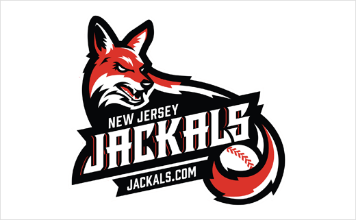
American baseball team the New Jersey Jackals has introduced a new brand identity, which includes refreshed logos and a revamped font.
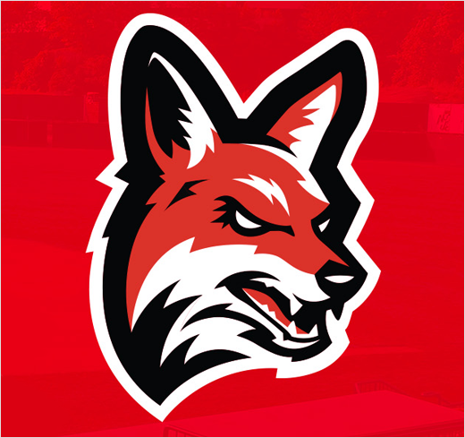
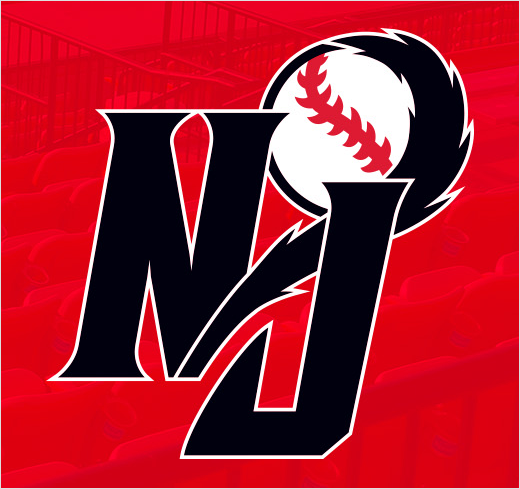
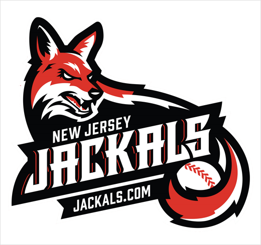
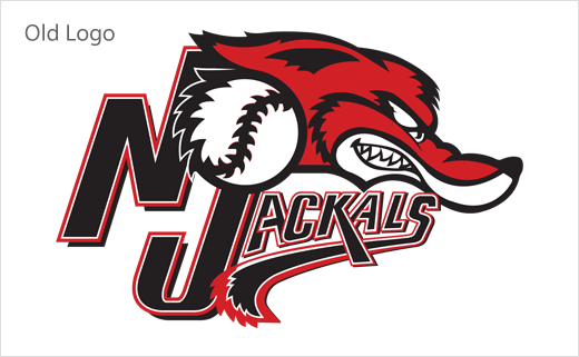
Created to mark the club's 20th anniversary season, the new logos retain the team's core visual elements such as the jackal head and "NJ" lettermark, as well as the signature red and black colours.
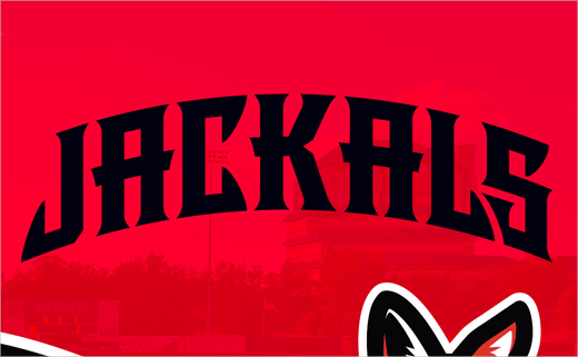
However, the updated club mascot – "Jack the Jackal" – is now depicted at an angle that has a greater dynamic and realistic appearance than before, while the new wordmark features a contemporary font with sharper serifs that mirror the teeth of the jackal. Both elements incorporate a baseball wrapped by the popular tail motif to reinforce the connection to the sport.
"Our design goal was to create an identity that would be more exciting and energetic, yet conveys strength and power. Both the logo and wordmark have been updated to better reflect who we are and to establish a bold new visual statement," said a club spokesperson.
The new identity has been created in collaboration with Arizona-based agency, Worthen Design.
Source: New Jersey Jackals


